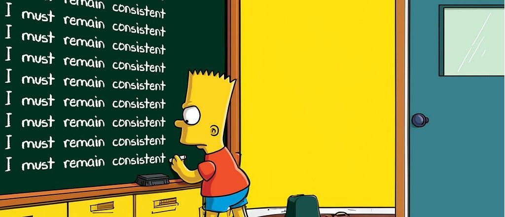
Can icons harm usability and when should you use them?
Iconography can be one of the biggest design elements that help make a brand recognisable. So, should you be using icons? Not necessarily… The better question here would be, when should you be using icons?

What do you mean by the word ‘icon’?
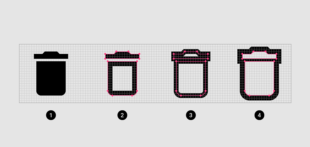
An icon is a symbol, and comes to us from the Greek word eikenai , meaning “to seem or to be like”. It can be literal, like the little trashcan on your computer screen, or metaphorical — as in a well known person linked to an idea, for example the Rolling Stones could be described as music icons.
In this case, I’m refer to an icon in its literal sense, as a small graphical element used to represent something.
UX Myths
“Build your product based on evidence, not false beliefs”
The above tag line reads across the menu of a website called UX Myths. They list thirty-four UX myths about design. Lucky number thirteen, is the myth entitled “ Icons can enhance usability ” .
Here’s a quick summary:
Many researchers have shown that icons are hard to memorize and are often highly inefficient. In most projects, icons are very difficult to get right and need a lot of testing. For abstract things, icons rarely work well.
Research findings and articles presented:
- UIE conducted two experiments to test how people use icons. First they changed the pictures of icons in a toolbar but kept them in the same location. People quickly adapted to this change. Afterwards, they kept the images but shuffled their location in the toolbar. This change confused the participants and caused problems for them.
- Michael Zuschlag says that “icons contrary to intuition, do not necessarily help the user find a menu item better than a text label alone. It’s not worth it.” He also discusses his views on UX Exchange.
- The former icon-only toolbar in Microsoft Outlook had poor usability and changing the icons and their positioning didn’t help much. The introduction of text labels next to the icons immediately fixed the usability issues and people started to use the toolbar. Another test revealed people remember a button’s position instead of the graphic interpretation of the function. — The Importance Of Labels
- A user’s understanding of an icon is based on previous experience. Due to the absence of a standard usage for most icons, text labels are necessary to communicate the meaning and reduce ambiguity. — Icon Usability
- In the battle of clarity between icons and labels, labels always win. — Labels always win.
- “When in doubt, always remember this: the best icon is a text label. ”
- Don Normann says that “Inscrutable icons litter the face of the [Apple] devices even though the research community has long demonstrated that people cannot remember the meaning of more than a small number of icons. Icon plus label is superior to icon alone or label alone. Who can remember what each icon means? Not me.
- In another study , the team of UIE observed that people remember a button’s position instead of the graphic interpretation of the function.
There are a few more items UX Myths present in their findings, but they repeat the same sentiments as the ones I’ve listed above.
What are the reasons for using an icon?
- The primary attribute for icons is being a common visual language which effectively bridges language gaps.
- Icons can be effective when they are used to improve visual interest and grab the user’s attention.
- Provide Functionality and Feedback. Imagine a video player with the words play and pause compared to the icons currently used. Icons allow us to communicate an idea quickly .
Guidelines for using icons…
1. Consider your design principles
Think about what principles you want to follow in your design work. If you follow a principle of decorative fun design, then perhaps the use of icons could enhance that principle. But, if you follow a principle of simplicity, be careful with your use of icons. Icons alongside labels, for example, won’t align to this principle.
If you need some guidance on creating design principles, you can read ‘ Defining brand design principles, a how to guide ’.
2. Be recognisable
A ‘Search’ icon is represented by a magnifying glass, ‘Settings’ are represented with gears, so these items usually don’t require labels. Platforms and brands like Facebook, Twitter and Instagram are so widely spread, their icons can be recognised without labels. If you find yourself making up an icon to represent an idea, chances are it’s not going to be recognisable. If an icon is not recognisable, then ask yourself if you should really be using it.
Universally understood icons work well i.e. print, close, play/pause, reply, tweet, share on Facebook etc.
3. Enhance functionality
Icons often work well when they represent something functional. Think of the play button that appears in a YouTube video. Often icons are used in software, and become recognisable with repeated use.
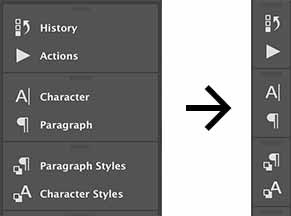
Adobe Photoshop’s list icons alongside the labels in their window panels. With repeated use, these icons become recognisable, these panels can later be collapsed to show just a list of icons.
Icons can serve as bulletpoints and also for structuring content i.e. file type icons for PDFs, DOCs, etc.
4. Test and refine
Don’t assume using icons will fix any UX problems you are having, always test and refine your work.
Further guidance
Read iA’s primer on icons for more guidance.
In Conclusion
Always consider the reason for using icons, and never assume icons will enhance the user experience.
Useful Resources
Check out some of my other articles:
Can icons harm usability and when should you use them? was originally published in UX Collective on Medium, where people are continuing the conversation by highlighting and responding to this story.
More articles...