Building a design system — where to start? (Part 3 — Size and spacing)
Part 3: Size and spacing
Building a design system — where to start?
Colour, space and typography — these elements are the building blocks for a solid design system. They are distinctive visual elements to focus on when building a brand. Let’s take a closer look at size and spacing …
What we’ll be covering…
Part 1
— First things first
Part 2
— Colour
Part 3
— Size and spacing
Part 4
— Typography
Part 5
— Bonus elements
Size and spacing
Spacing is often an overlooked element but is one of the biggest influences in creating a distinguishable brand. Many popular frameworks like Bootstrap and Foundation ignore the idea of a solid base-line grid. Be cautious of picking off the shelf frameworks like these. Not having a consistent unit of measurement can lead to layout inconsistencies between pages, particularly on projects with two or more designers. The “system” is only good if it is easy to follow and repeat.
8 Point Grid Sytem
There are many ways to define your measurement units, my recommendation would be to use multiples of eight. Why eight you ask? Well eight is divisible by 2 and 4. This becomes important when considering displays that multiply pixel sizes due to higher resolutions. For example, a resolution of 1.5 would multiply 5px by this number resulting in a half pixel offset — The result is an edge that appears blurred, caused by the antialiasing of that half pixel. Half pixels don’t happen on an 8pt grid system.
A point (pt) is a measurement of space that is dependent on screen resolution. The simplest explanation is that at a “1x” resolution (or @1x), 1pt = 1px.
At a “2x” resolution (@2x), 1pt = 4px because resolution doubles on both the X and Y axes making it 2px wide by 2px tall (2px x 2px).
At a “3x” resolution (@3x), 1pt = 9px (3px x 3px) and so on.
( https://blog.prototypr.io/design-system-ac88c6740f53 ) ~ Marco Lopes
Using a base of 8 also matches up to the default browsers base font-size of 16px (8x2). Some of the most popular screen sizes are also divisible by 8 on at lease one axis, which makes for an easy fit.
Scaling by increments of 8 offers a good amount of options without overloading you with variables like a 6 point system, or limiting you like a 10 point system. Ultimately you have to decide what size is right for your audience. ~ Elliot Dahl
Scale
An alternate approach to multiples of 8 is to use a scale. A modular scale helps create a rhythm with spacing that is meaningful. Spacing where the increments between spaces are based on a ratio. A popular scale to use is the Fibonacci sequence , a scale which occurs throughout nature.
If the 8 point grid system appeals to you, identify a modular scale, pick the sizes closest to a multiple of 8 or 4 and use that to inform your spacing elements (rounding the sizes to the nearest multiple of 8). This avoids the pitfalls of a strict scale where you end up with crazy numbers like 2.618, every browser will try to round this in their own way, resulting in less predictability.
Meaningful sizes
Elliot Dahl mentions in his writings the three general typography system archetypes, which can also be applied to spacing.
- Marketing — Built to tell a specific story and inspire visitors to spend their time and/or money on the site. White space is embraced, often more dramatic, utilising a larger scale ratio, resulting in more dramatic gaps between spacing elements.
- Editorial — To convey a large amount of information. Spacing is usually less dramatic in this cases with tighter spacing compared to the marketing archetype.
- Data — Built to solve a user problem like filing taxes, managing a git repo, or visualizing performance metrics. Spacing here can often be much tighter due to large amounts of data that need to be presented, the ratio between spacing is often much smaller than the two other archetypes mentioned above.
EMs and REMs vs Pixels
A case could be made for both using EMs, REMs or Pixels. The great thing about Pixels is they are they are rigid and exact, the bad thing is they are rigid and exact. So, 1px will always display as exactly 1px. If you want to be rigid, and less flexible, pixels might be the option worth considering.
The great thing about EMs and REMs is they are abstract and based on a font-size. The bad thing about EMs and REMs is they are abstract and based on a font-size. So, 1em or 1rem could translate into 16px or 160px, depending on the font sizes. This, however, does not imply that EMs and REMs cannot be rigid and as exact as pixels.
EMs and REMs give the ability to scale elements up and down, instead of being stuck with fixed sizes. We can use this flexibility to make our designs easier to adjust during development, more responsive, and to allow browser users to control the overall scale of sites for maximum readability.
So what is the real drawback?
Using EMs and REMS is damn confusing, and design software tools all use pixels as their measurement unit. This makes it really hard to use for designers and developers alike.
What is a EM?
When using em units, the pixel value you end up with is a multiplication of the font size of the element being styled.
For example, if a div has a font size of 18px, 10em would equate to 180px, i.e. 10 x 18 = 180.
What is a REM?
When using REM units, the pixel size they translate to depends on the font size of the root element of the page, i.e. the HTML element. That root font size is multiplied by whatever number you’re using with your REM unit.
For example, with a root element font size of 16px, 10rem would equate to 160px, i.e. 10 x 16 = 160.
For a deeper dive into the REMs and EMs, Evanto’s Tuts+ have a great article entitled: Comprehensive Guide: When to Use Em vs. Rem
Should your system need to cater for the three archetypes mentioned earlier, REMs will give you that flexility by simply adjusting a base font-size linked to a ratio. The guys at CodyHouse have written an excellent article , along with code snippets, on how they achieved this in their design system.
Combating REM and Pixel confusion
This confusion can be combated upfront with a few calculations focusing on REMs and abstracting those into tokens.
Step 1: Do the Math upfront
Set the base font size upfront and then do the math, developing the px to REM ratio in line with your scale.
Example:
If you set base font to 16px, 1rem equals 16px.
Therefore:
1rem = 16px
1.25rem = 20px
If you set base font to 8px, 1rem equals 8px.
Therefore:
2rem = 16px
2.5rem = 20px
Step 2: Naming your sizes
Abstracting your values out into named tokens helps eliminate confusion. It provides a common language both designers and developers can use. Designers can still design using pixels, and developers can code in REMs, while the integrity of the system remains intact.
Two common naming conventions for tokens in this case are:
- Following a numeric sequence (space-1, space-2, space-3, etc.)
i.e.
space-1= 16px and 1rem
space-2= 24px and 1.5rem
space-3= 32px and 2rem
etc… - Using the convention of T-shirt sizes (xs, s, m, l, xl, etc.)
i.e.
space-s= 16px and 1rem
space-m= 24px and 1.5rem
space-l= 32px and 2rem
etc…
This allows future changes to happen easily without changing the common language of the design system. It allows the spacing system to flex on specific sizes at each step, while maintaining the integrity of the codebase.
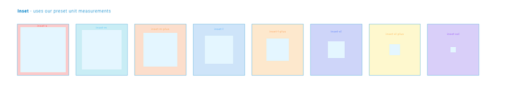
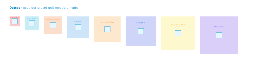
Margins and Padding
A common occurrence is also to use uniform padding and margins on components and elements. You can then extrapolate this naming convention into inset/padding tokens and outset/margin tokens, following the same principle. i.e.
inset-1 =
16px padding and
1rem padding
inset-2 =
24px padding
and
1.5rem padding
inset-3 =
32px padding
and
2rem padding
etc…
or
inset-s =
16px padding and
1rem padding
inset-m =
24px padding
and
1.5rem padding
inset-l =
32px padding
and
2rem padding
etc…
And
outset-1 =
16px margin and
1rem margin
outset-2 =
24px margin
and
1.5rem margin
outset-3 =
32px margin
and
2rem margin
etc…
or
outset-s =
16px margin and
1rem margin
outset-m =
24px margin
and
1.5rem margin
outset-l =
32px margin
and
2rem margin
etc…
Recap
Combining a modular scale with a token system alongside a semantic naming convention will allow for a robust approach to powering the spacing system. You’ll also be achieving the three goals we should aim for (mentioned in part 1 ):
- Semantic naming conventions that can be easily understood and applied.
- Designers and developers work together — The design system needs to be realised in code as well as design.
- Be able to change it without breaking it — abstract hard values and concepts out to tokens, this will allow for future flexibility should you decide to change something in the future without breaking everything.
Next up…
We’ve tackled concepts like design tokens and principles , setting up colour , and now size and spacing. There is one other element every design system needs to tackle… typography .
Part 1
— First things first
Part 2
— Colour
Part 3
— Size and spacing
Part 4
— Typography
Part 5
— Bonus elements


Further reading, resources and insights when tackling size and spacing:
8-Point Grid System:
Spacing:
Modular scale:
Building a design system — where to start? (Part 3 — Size and spacing) was originally published in UX Collective on Medium, where people are continuing the conversation by highlighting and responding to this story.
More articles...