Building a design system — where to start? (The extras: Icons, time and animation, shadows, corners
Part 5
Building a design system — where to start? (The extras: Icons, time and animation, shadows, corners or edges, grid systems and breakpoints)
Colour, space and typography — these elements are the building blocks for a solid design system. They are distinctive visual elements to focus on when building a brand. Then there are a few bonus elements to consider …
What we have covered so far…
Bonus elements
Spacing, Colour and Typography are only the starting points for building a design system. There are many other atomic elements that need to be considered before designing the components required in your system. Here are a few worth looking into…
Icons
Outside of colour, spacing and typography, one could argue that icons are the next most important elements to consider. Icons help to creating a unique and recognisable brand.
Don’t fool yourself into thinking that icons will improve the usability of your product. Icons need to be recognisable first, to influence any positive usability. So, when considering iconography, also consider when you should be using icons? For a more in-depth looking into the usability of icons, I’ve written a dedicated article on this subject: Can icons harm usability and when should you use them?
Things to consider
Make sure the icons you design and include into your design system are fit for purpose. Icons that occupy a small space need less detail than those used at larger scales.
Consider the thickness or weightiness of your icons; should they be solid or outlined? Are they for iOS or Android, or should they have their own unique style.
Icons can also be used to represent an app or play a functional role like in a WYSIWYG editor. Consider the use case for icons, and design for them appropriately.

Consider animation alongside icons. Animation can reflect the action an icon performs in a way that adds polish and delight. Also think about animating the transition between two icons to signify their link, for example the play and pause icon in a video player. Icon animations can be used to reinforce a change in state.
Time and animation
While you are thinking about animation for icons, why not think about animation at a design system level. What characteristics need to be reflected in the animation style you use? Should animations be elegant and smooth, or bounce with happiness. Consider timing — the speed of an animation can have a huge effect on the ‘feel’ of an interface.
InVision have released an excellent series of free online books with deep insights on building strong design practices under the name of Better Design. I recommend reading their animation handbook for a much deeper understanding of this subject.
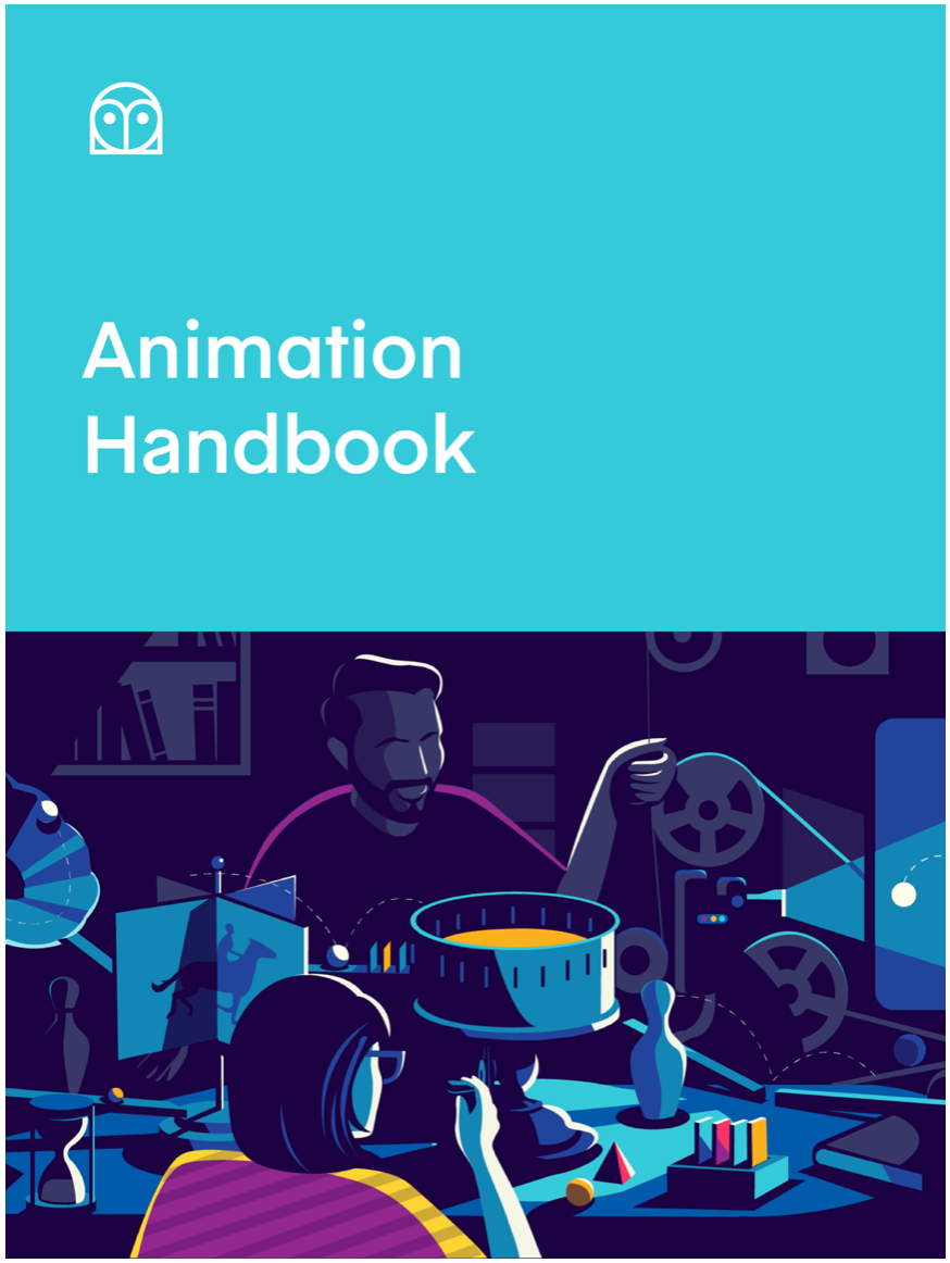
When it comes to software design, animation is a limitless way to make digital products feel more real by replacing “telling” with “showing.” Learn how you can use animation to demonstrate abstract concepts, make products feel more life-like, and instill more emotion into digital experiences.
— Animation Handbook by Ryan McLeod
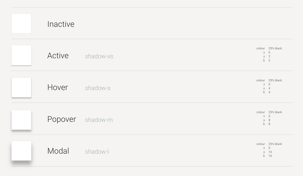
Shadows
Shadows are often use used as a visual cue to help differentiate the various levels of an interface. Google’s Material Design makes extensive use of this idea in their design system. Elevation in Material Design is measured as the distance between Material surfaces.
Think about shadows in a systematic way. Document a visual style for shadows and their relevant use cases. What happens when you hover over an element — does it elevate and create a shadow, or get pressed down, eliminating a shadow? Think about hover states, popovers and modals, how should shadows be treated in these use cases? Map these decisions to design tokens for easy reuse.
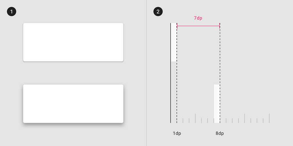
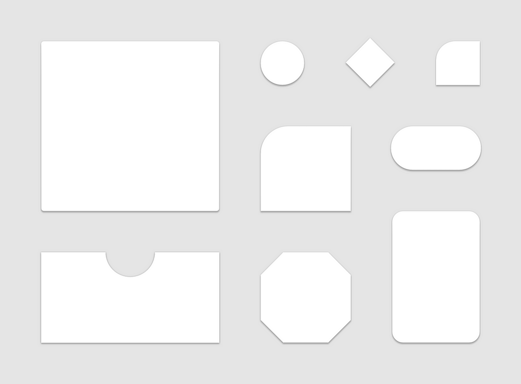
Corners and edges
Unless you decide to go with sharp corners throughout your design system, you’ll want to think about rounded edges in a tokenised way. Often designers like to use rounded corners on buttons, but corners could extend to tables, cards, drop-downs, tooltips and various other components. You may also decide to treat corners differently depending on their use-case.
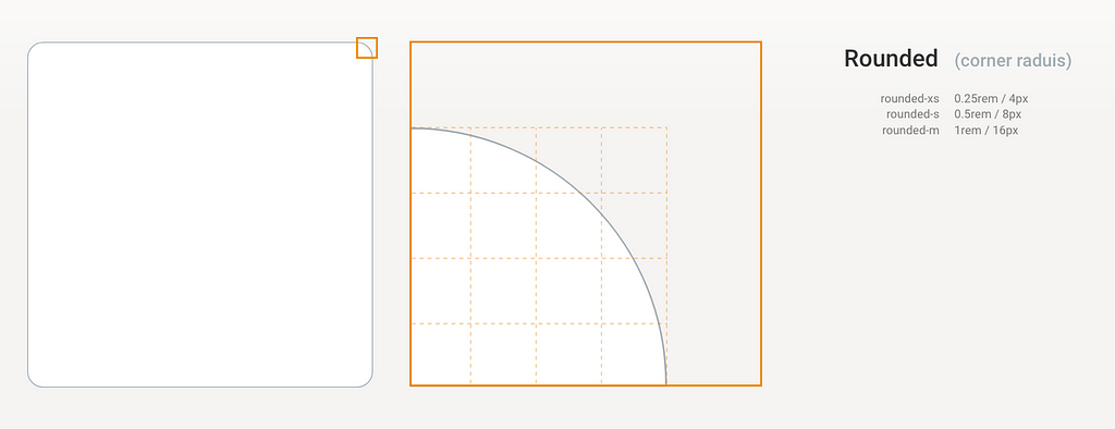
Corners could extend past rounded edges, consider any possible shapes you may use in your UI and build a token system around them.
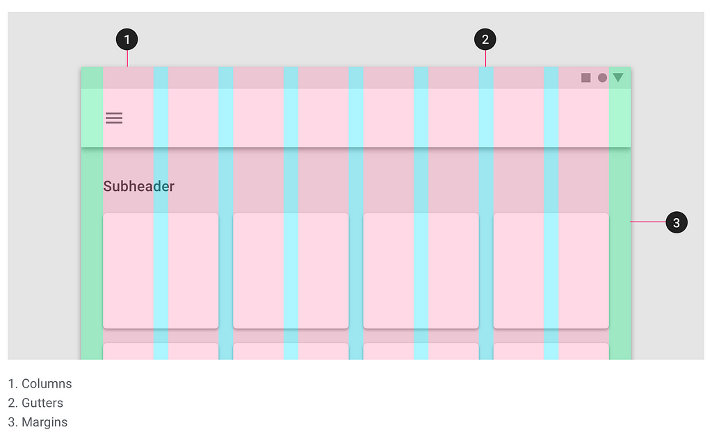
Grid system
Defining a grid system can go a long way in helping to create patterns and layouts from a page down to a component level. Grid systems have been a fundamental design tool used throughout the ages, moving into print, and now digital design.
Consider every front-end design system available on the web, from Bootstrap to Zurb Foundation and Material.io , they all have defined some sort of grid system. This involves dividing the viewport into various vertical columns, most often twelve or sixteen, and defining the gutter spacing between them. The CSS Grid Layout Module offers a grid-based layout system, with rows and columns, making it easier to design web pages without having to use floats and positioning.
Consider how your spacing and size play into this, will you be working in a fixed or variable widths and if you should specify margins on either side of your grid.
Responsive Breakpoints
As Veronica Raducan states in her article over at Creative Tim , in today’s day and age, responsive web design isn’t a feature anymore. It’s pretty much a standard you have to abide by if you want to be taken seriously by users and search engines alike.
Responsive design is the process of creating a single design that ‘responds’ to different screen sizes. Elements and components then rearrange themselves according to these different screen sizes to fit within the given space comfortably. Wikipedia describes it as “an approach aimed at crafting sites to provide an optimal viewing experience — easy reading and navigation with a minimum of resizing, panning, and scrolling — across a wide range of devices (from mobile phones to desktop computer monitors).”

Determine the various breakpoints where designs breakdown and needs to reflow. Although published back in 2016, David Gilbertson has written the best article I’ve come across when it comes to setting up breakpoints: The 100% correct way to do CSS breakpoints.
The article covers these three tips:
- Get your breakpoints right
- Name your ranges sensibly
- Be declarative
Final thoughts and tips
- Design systems are never done, make piece with the idea that it will never be perfect. It’s better to have something than nothing, so don’t wait for all your elements to be ready before using it. A design system will alway evolve.
- Designers and developers need to work closely along with brand when building out a design system.
- Develop principles and document when and how to use various components — simply having a UI kit and code is not good enough.
- You’re never to small, and it’s never too late to start building a design systems. Design systems can be complex or simple and everyone’s needs will be different, this all depends on who the design system serves.
This is the last article in a series, read the complete series here:
Part 1
— First things first
Part 2
— Colour
Part 3
— Size and spacing
Part 4
— Typography
Part 5
— Bonus elements
Further reading and insight
Grid systems
Icons
Animation
Corners and edges
Responsive design
Building a design system — where to start? (The extras: Icons, time and animation, shadows, corners was originally published in UX Collective on Medium, where people are continuing the conversation by highlighting and responding to this story.
More articles...