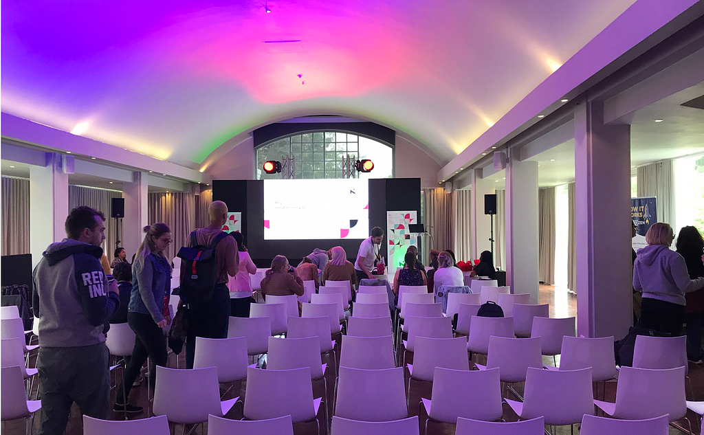
What I learned at the PixelUp2019 — Day 2
What I learned at the PixelUp2019 — Day 2
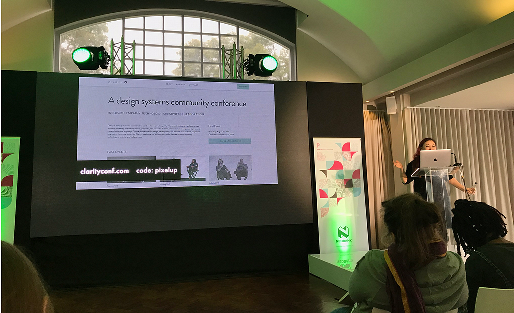
2 days, 16 talks
Day1 | Day 2
Day 2 speakers:
- Katya Kostyukova — People First. Designing Facebook Spaces.
- Jina Anne — Design systems are for people
- Sebabatso Mtimkulu — Creating a safe space for designers to fail
- Andrew Harder — Unleashing the power of design in growing organisations
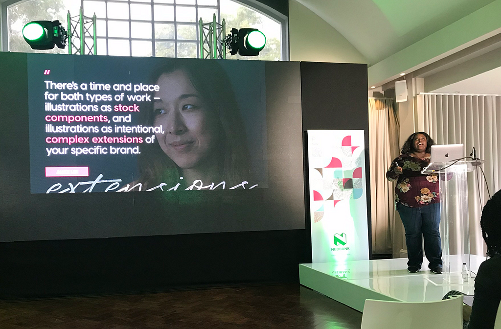
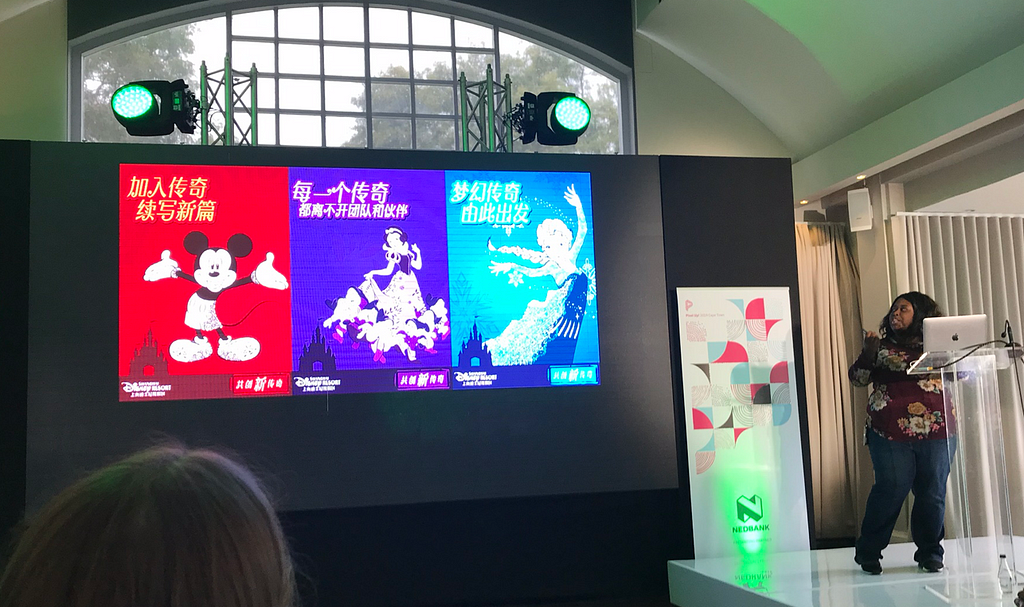
- Mina Markham — Full-featured art direction for the web
- Eva-Lotta Lamm — You can sketch. (You might just not know it yet.)
1. People First. Designing Facebook Spaces.
Katya Kostyukova — Design Manager on Social VR at Facebook
Talk summary posted on PixelUp:
With Virtual Reality, we have an opportunity to build a first people centered platform. If for decades the computers and smartphones have been organized around applications, in VR we can switch that around entirely and design experiences where people are at the core, and then build utility and services on top.
VR is the next big leap for connecting and bringing people together. It has the power to connect people across time and distances in a new powerful way that makes you feel like you are right next to that person.
That’s exactly what we’ve been trying to do with the first product we’ve built, Facebook Spaces. With Facebook Spaces you can be with your friends and feel like you’re in the same room, even if you’re thousands of miles away from each other. Everyone has an avatar, and sits around a virtual table. That’s the core of the experience. People. Nothing is more important in Spaces than the people you’re with.
Learnings:
With all the apps, we lost something — people. At Facebook, VR is a people first platform and not just for gaming and entertainment. Facebook have created a product called Facebook Spaces, they are designing for future users, where VR is ubiquitous.
Principles
1. Presence
- Present in a non physical world — self presence; social presence; spacial presence
- Use avatars — whaen using realistic heads, it felt wierd and creepy, entering into the uncanny vally. It sill allows expressiveness.
- Hands are important — movement and gestures helped in recognising people
- Gestures rendered facial expressions (there was no way to track faces)
2. Agency
The capacity to act and influence the environment. (Input: hand held controllers)
Inside the VR : they used allot of skeuomorphism, tools like pens, cutout tools est.
Those outside of VR : Video calls can be made with people who arn’t inside the VR. Comments and emojies became 3D objects. 3D objects in VR can be shared in a Facebook feed and then brought into the real world through AR.
3. Interface
- Environment: Where is the interface in this world?
Consider the field of view: Curved UI and Depth - Confront physical movement: How does the interface re-orientate?
Sitting vs Standing. A table served as an anchor, and keept people anchored. They set up a ‘personal boundary’ — so people could not get to close.
“Tech should bring people closer, rather than keep them apart”
Eva-Lotta Lamm on Twitter
Super interesting talk by @katya_alexander taking about considerations when designing for virtual reality #PixelUp2019 #sketchnotes #VR
2. Design systems are for people
Jina Anne — Design Systems Advocate

Talk summary posted on PixelUp:
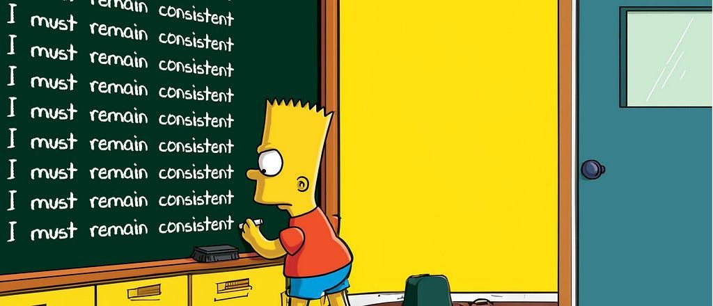
Design Systems grew out of a need to build consistent, cohesive visual experiences across devices and platforms, and to centralize and consolidate design efforts.
While they create a better user experience, increase the efficiency of teams, and improve the quality of products, Design Systems need to be more than just inventories and deliverables, if they are to be successful.
As Jina Anne shows us in her seminar, Design Systems empower change within an organization and form the bedrock of a company’s culture and community. Your design system ultimately serves people: both your customers and your colleagues.
Design systems fail when they lack a vision, a shared language, and purpose. Designers, developers, product managers, and anyone interested in building a successful design system in their business will benefit from this seminar.
Learnings:
- Why design systems? Tools; automation; patterns; closing the gap between dev and design.
- The purpose of design systems? For people (the end users)
- For success and productivity, design ststems do’nt inherently make this happen, people make this happen.
- Design systems empower change in culture, how people work and communicate.
- Material outputs: Files
Non-material outputs: Principles - Principles should be relatable and memorable, keep people connected and be included in presentations.
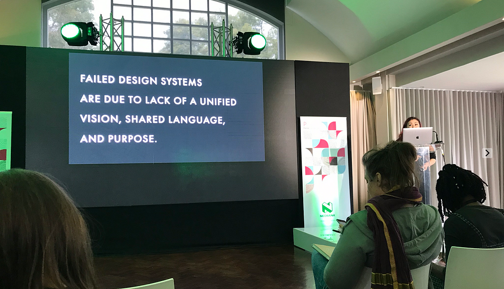
- Design systems fail because of a lack of unified vision, shared purpose and language.
Values
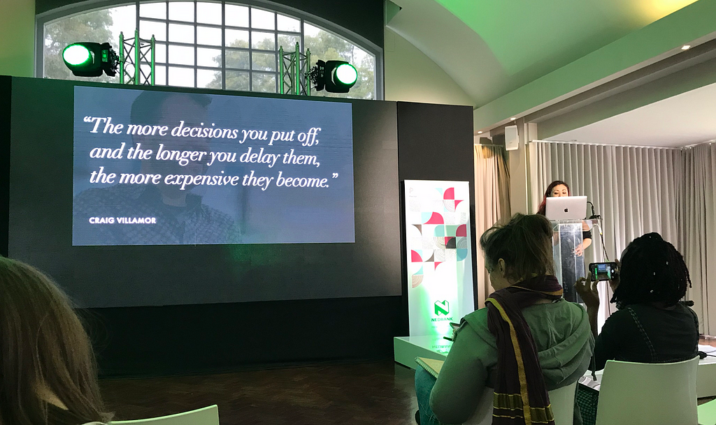
‘You cannot innovate on product unless you innovate on the way you build them”
- Great products are the ones you create with great customer support. Create a community, everyone should be the owner.
- Listen : Build relationships and solve problems together; Focus on the individual; Help other go further
- Work/pairing sessions : Mutual learings. Design systems as a advisory board.
Types of people
- Takers — serve me
- Giver — do for you
- Matcher — do for me and I do for you
“Designs are for people”
Presentation deck:
3. Creating a safe space for designers to fail
Sebabatso Mtimkulu — Head of Design at Vodacom
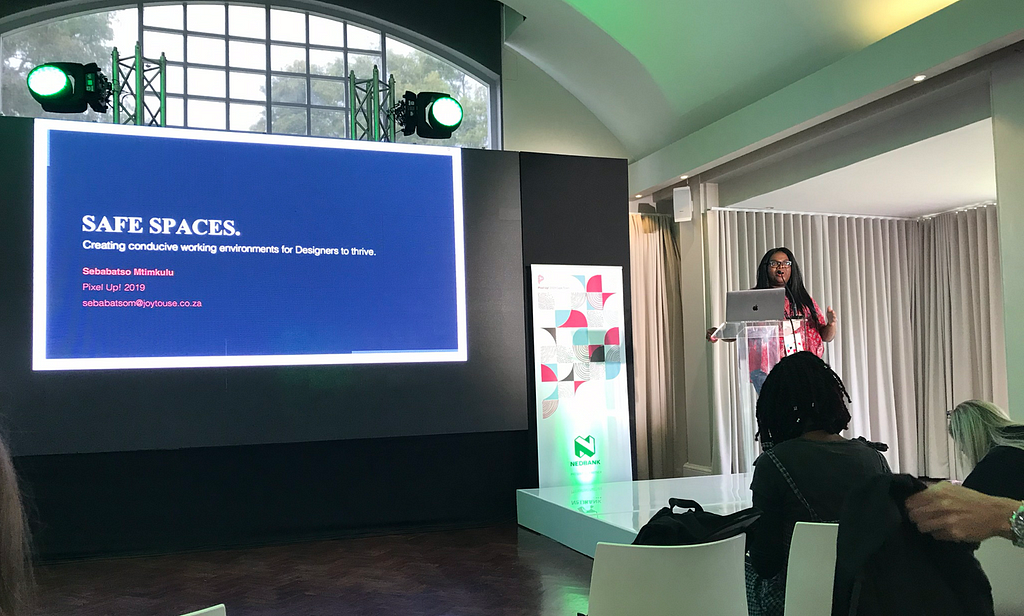

Talk summary posted on PixelUp:
Design is the conception and realisation of new things. There is a natural fear present when a new thing is being created. This comes in various forms; maybe a fear of being perceived as incompetent, insignificant, and more commonly, a fear of failure. This can be daunting if part of your everyday reality. Most often than not, Designers operate in this state of mind.
This talk is for all Designers and those that look after Design teams.
Learn about the acceptable, natural ups and downs necessary to fuel the successful creation of new products Learn how to identify unhealthy states of discomfort, and How to apply tools that help create spaces where Designers have permission to test assumptions, learn and ultimately thrive.
Learnings:
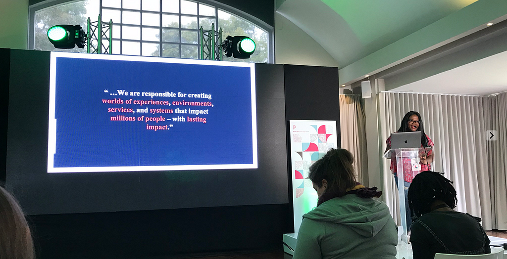
According to the World Economic forum on their report on the future of jobs, UX was seen as a new role (2018–2022) — Designers have a massive responsibility.
What is design? The conception and realisation of new things. New thing, bring new problems, this creates fear and anxiety for designers. Designers spend allot of time prioritising others and the environments are ignored that help desingers do thier work.
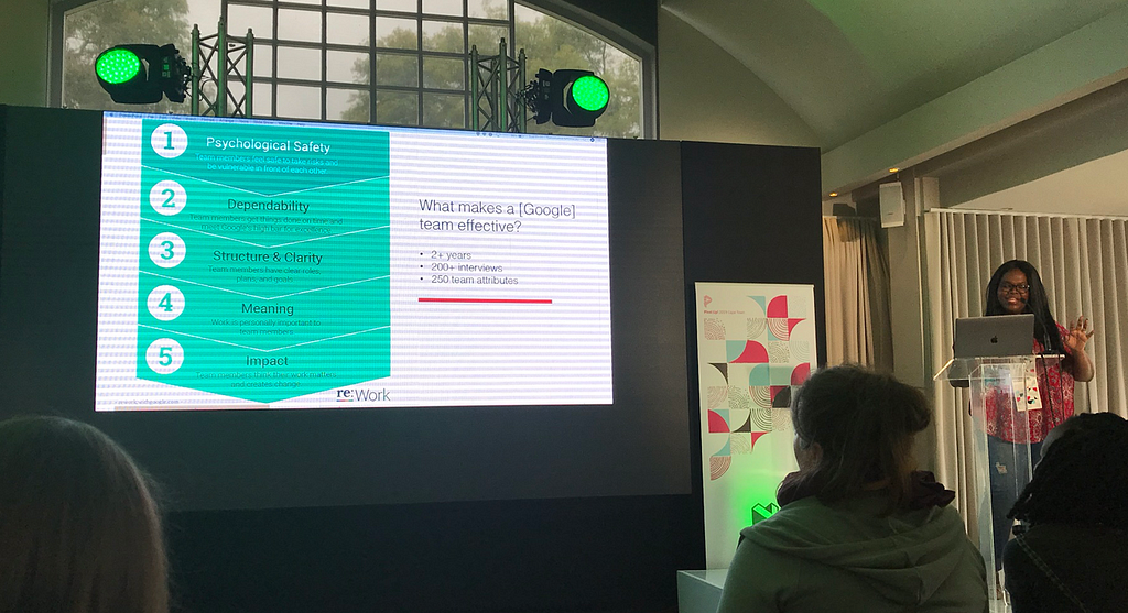
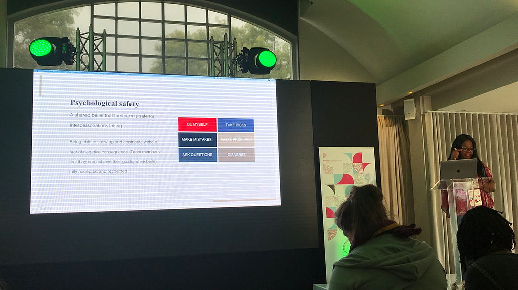
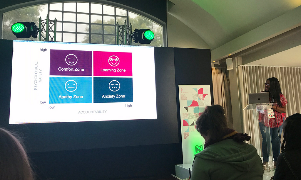
We need a human centred design approach to managing design teams. Good teams are effective when there is psychological safety — take risk; be myself; make mistakes; raise problems; ask questions; disagree.
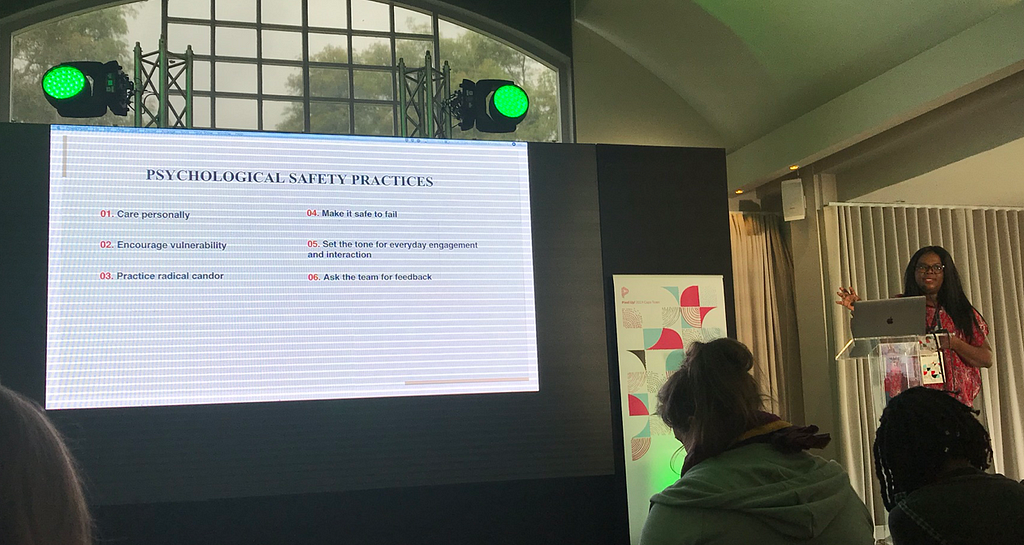
Safety practices
1. Caring personally
We are all human beings with feelings. When feelings a repressed, we feel alienated and hate going to work
2. Encourage vulnerability
This does not come naturally. Kill perfectionism.
“Vulnerability is the birthplace of creativity, innovation and change” — Brene Brown
3. Practice radical candour
Don’t sidestep the difficult parts of being a boss. Tell people when thier work is not good enough, don’t sugercoat feedback.
4. Making it safe to fail
(X framework from Google)
- Intelligent failer — openly communicate when an idea wont work
- When a team kills a project, they still get a bonus
- Failures are celebrated by peers and applauded by management
- Failed prototypes are showcased
- Annual celebration of failed work — people hear what when wrong and the learnings
- Failed projects get a formal sense of closure, people let go of the emotional baggage
5. Set the tone for everyday engagement and interaction
- Teach stakeholders how to treat and communicate with design teams (so they give valuable feedback)
- Teach members of the design team how to communicate and interact with each other.
6. Ask the team for feedback
- How are you feeling?
- Anything you are uncomfortable with?
- Do you have feedback for me?
“Software + Hardware = Heartware”
Eva-Lotta Lamm on Twitter
Some more #sketchnotes from #PixelUp2019: @sebamtimkulu talking about creating safe spaces for good design to happen.
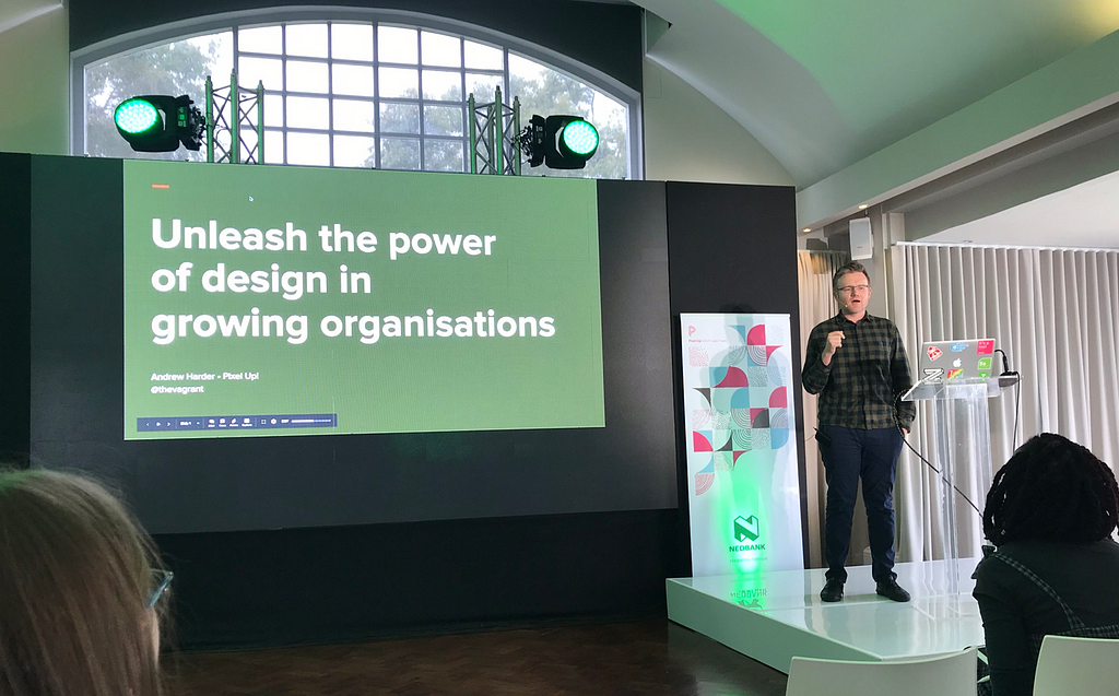
4. Unleashing the power of design in growing organisations
Andrew Harder — Design Director, Consumer Selling at eBay

Talk summary posted on PixelUp:
Design has a unique power to let us delight customers, build successful businesses and create new technological possibilities. However as our teams grow in size and complexity, many factors can limit the potential of design.
In this talk, Andrew shares his perspective on the three core principles of successful design and how we can overcome the unique challenges of large organisations to create beautiful products that can change the world.
Learnings:
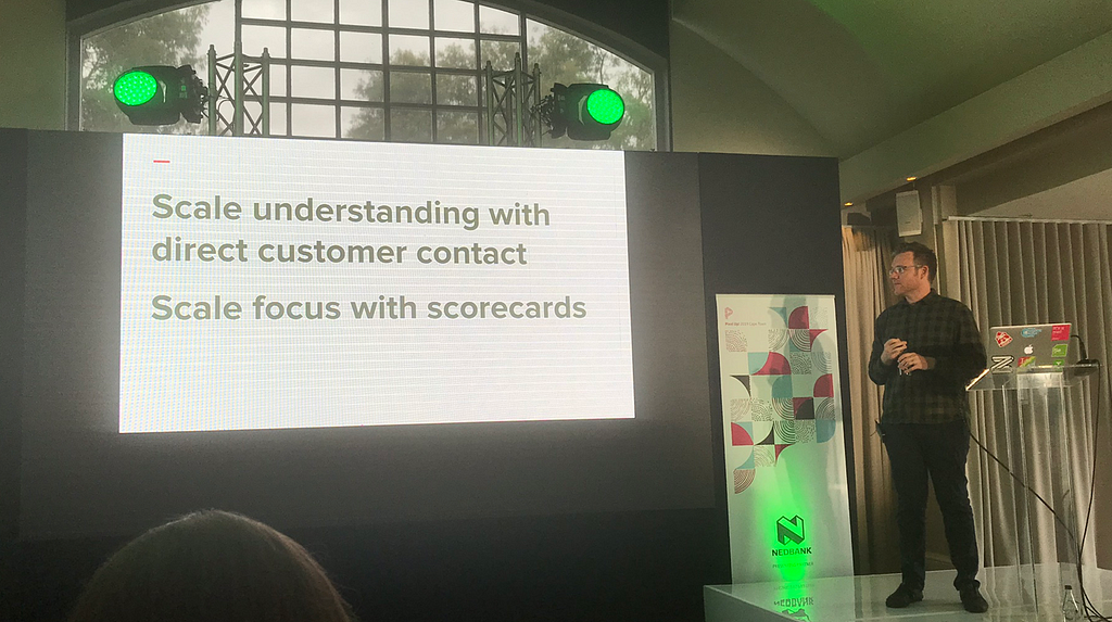
Design holds the key to success. There are growing pains when scaling up;
Solo → Team → Unit → Organisation
How can we unleash the power of design in growing organisations?
Principles help manage the transistion between design and business.
1. Empathy — understand your whole customer
- A deeper understanding of the human experience
- Emotions and stories are the cornerstone of empathy
- Empathy guides desisions through understanding experience
Internal complexity is easier to solve than external certainty
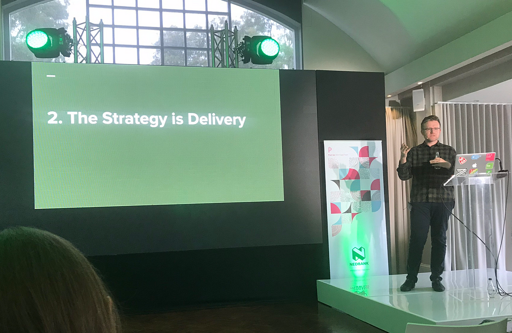
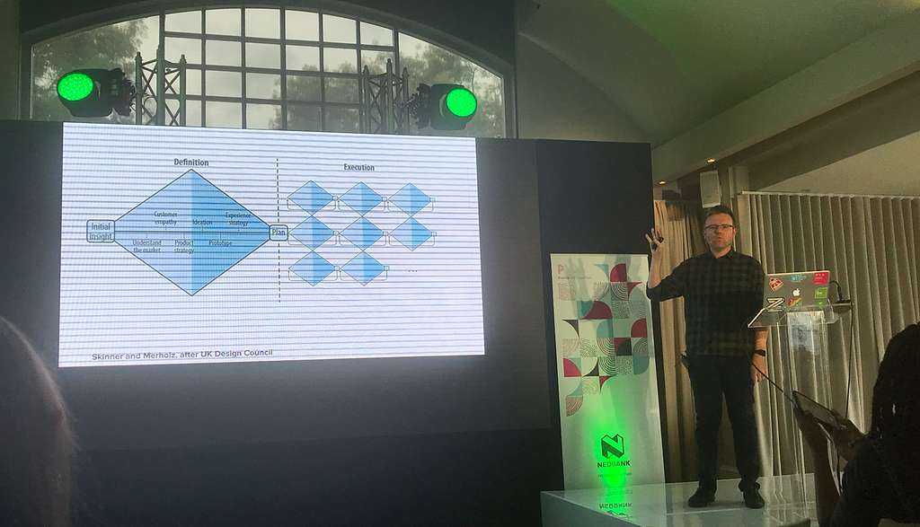
2. Delivery — The strategy is delivery
Move fast and break things — Build → Measure → Learn →Repeat
- Iteration allows you to find the small changes that make a big difference
- Product complexity increases with scale
- Build a holistic product vision (the north star)
3. Protect — Protect the ugly baby from the hungry beast
New ideas are vulnerable and need to be protected.
Example: Kodak — because of their amazing business model, they killed the digital camera idea.
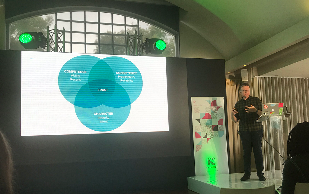
Protecting creativity at scale — trust is the currency of human ogranisation. Intent: Show you care more than just about yourself.
5. Full-featured art direction for the web
Mina Markham — Senior Engineer at Slack

Talk summary posted on PixelUp:
Now that we have the tools to superpower our layouts, we can start to reimagine how we approach art direction and design on the web.
By taking advantage of technologies, some new and some overlooked, we can create a progressively-enhanced design that’s powered by feature queries; one that’s localized for an increasingly global audience.
In this talk drawn from her work for Slack and other properties, Mina walks through her process for enhancing design and shows how little changes lead to big design payoffs.
Learnings:
What is art direction?
- The combination of art and design to evoke a remotional response.
- Is progressive, localised, cross-functional, systematic
1. Progressive enhancement
- Everything has their own experience rather than the experience designers demand of them
- A default experience
- Build the markup first, a rethingk of how we engineer our projects (not a fallback)
- It’s a feature, not a bug (not looking the same everywhere)
2. Localised
- Localising is not translation
- Context is everything
3. Cross-functional
- On the web, front-end is more important than design
- Designers and devs need to work in the same space (pair designing)
- Collaboration breeds inclusivity
- Inclusive design is a process, not a result
- Don’t remove defaults (they are assessable and functional)
4. Systematic
- Have a design system
- A foundation of rules
- Rules can be broken —
Strict (products) vs Loose (More editorial) - Stop fighting the snowflakes, enable snowflakes
- A visual language per locale?
“Art direction is powered by design systems”
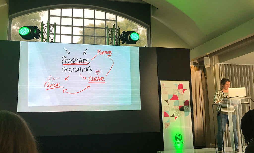
6. You can sketch. (You might just not know it yet.)
Eva-Lotta Lamm — Visual thinker & designer
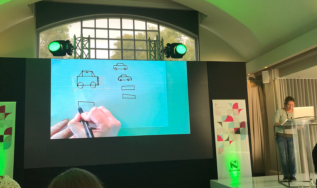

Learnings:
Pragmatic sketching is quick, clear and has purpose.
1. Confident lines
Commit to doing one line at a time
2. Clear shapes
Lift your pen after each line. Close your shapes.
Types of shapes:
dots; lines; triangles; squares; circles and squiggles
3. How to arrange shapes
- Make an inventory of shapes needed
- Play with preportions
- Practice
4. Keep things flat
- Practice the choreography — the order of drawing out shapes
- Choose the most iconic view
- If there isn’t one, combine views to create a flat perspective (font+side)
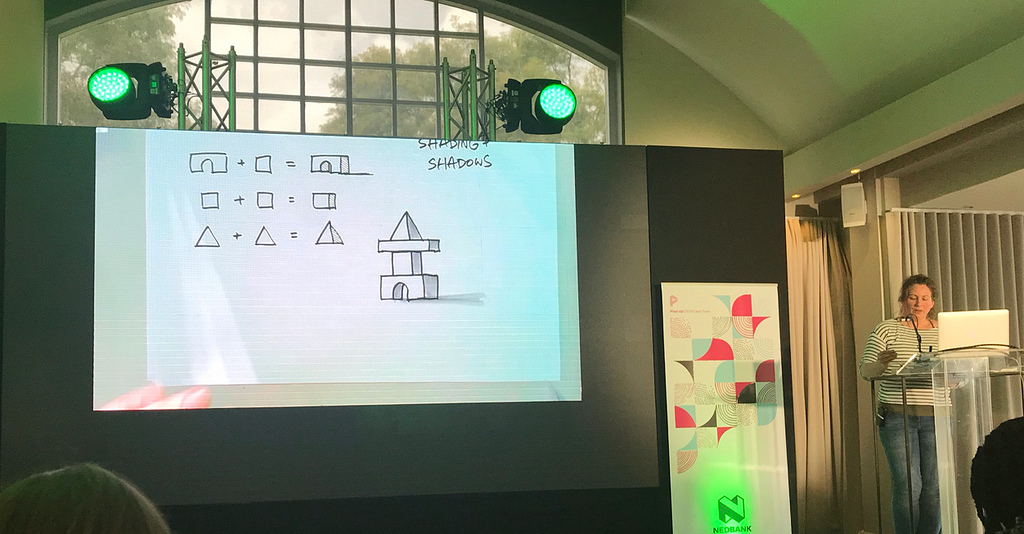
5. Shading and shadows
- For shadows, use a consistent light source (top-left)
- Shading gives an object more dimension
- Shadows on the outside makes an object grounded
6. Anchor an object in space
- Combine space and shadow
- Draw a horizon line
- Leave gaps between shapes
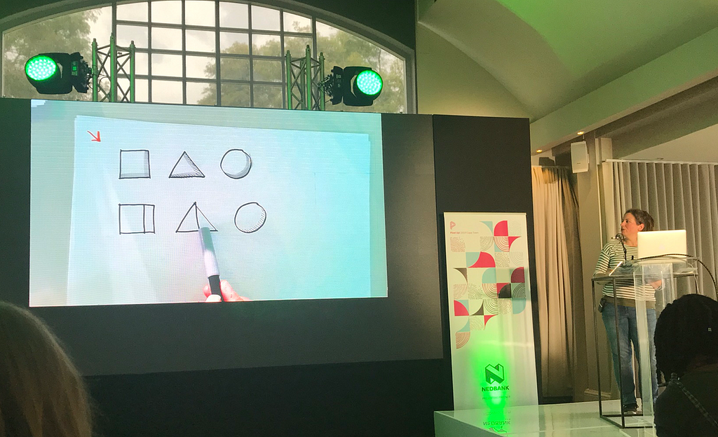
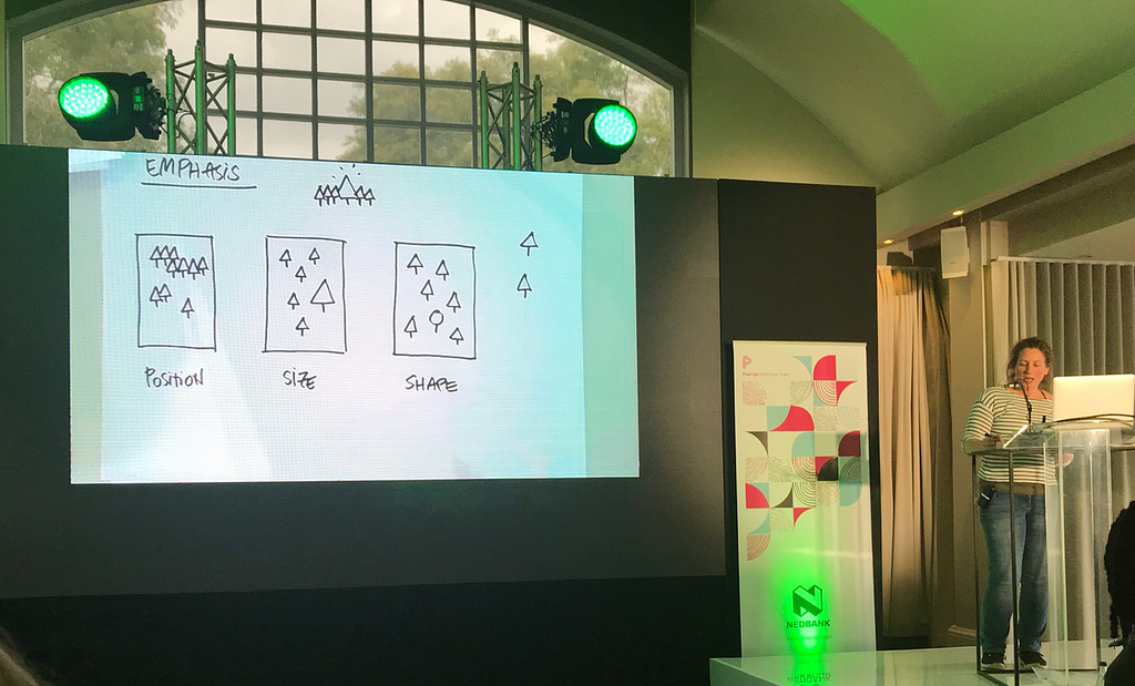
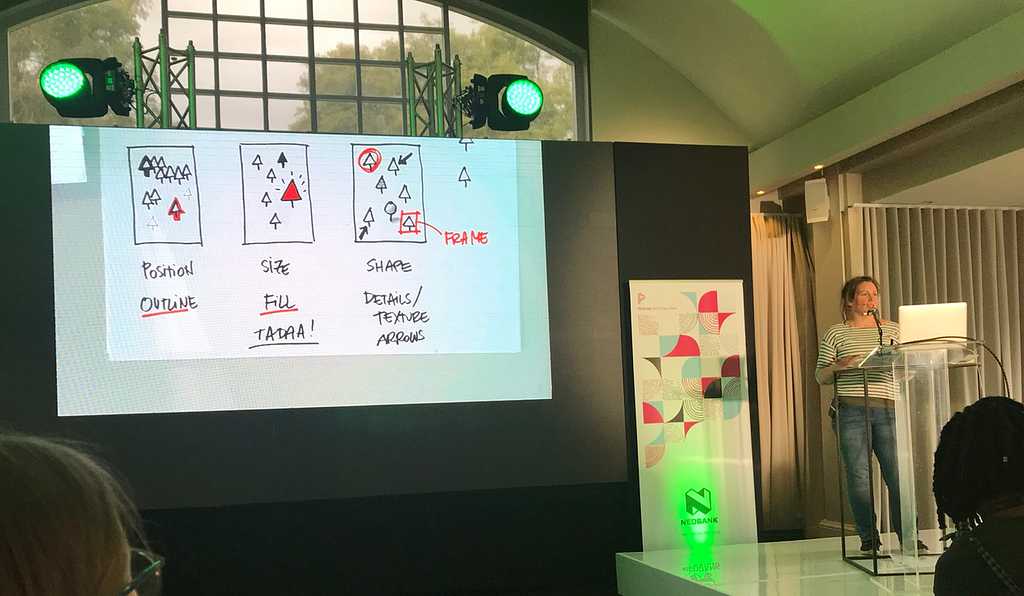
7. Emphasis and visual hierarchy
- Through position (grouping and separation)
- Size
- Outlines (Contrast)
- Fill
- Texture and detail
- Additional objects — lines and shapes (eg: arrow)
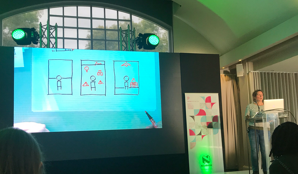
8. Detail
Add context if detail is missing in the object (eg: hand holding a square indicates a phone)
More articles...