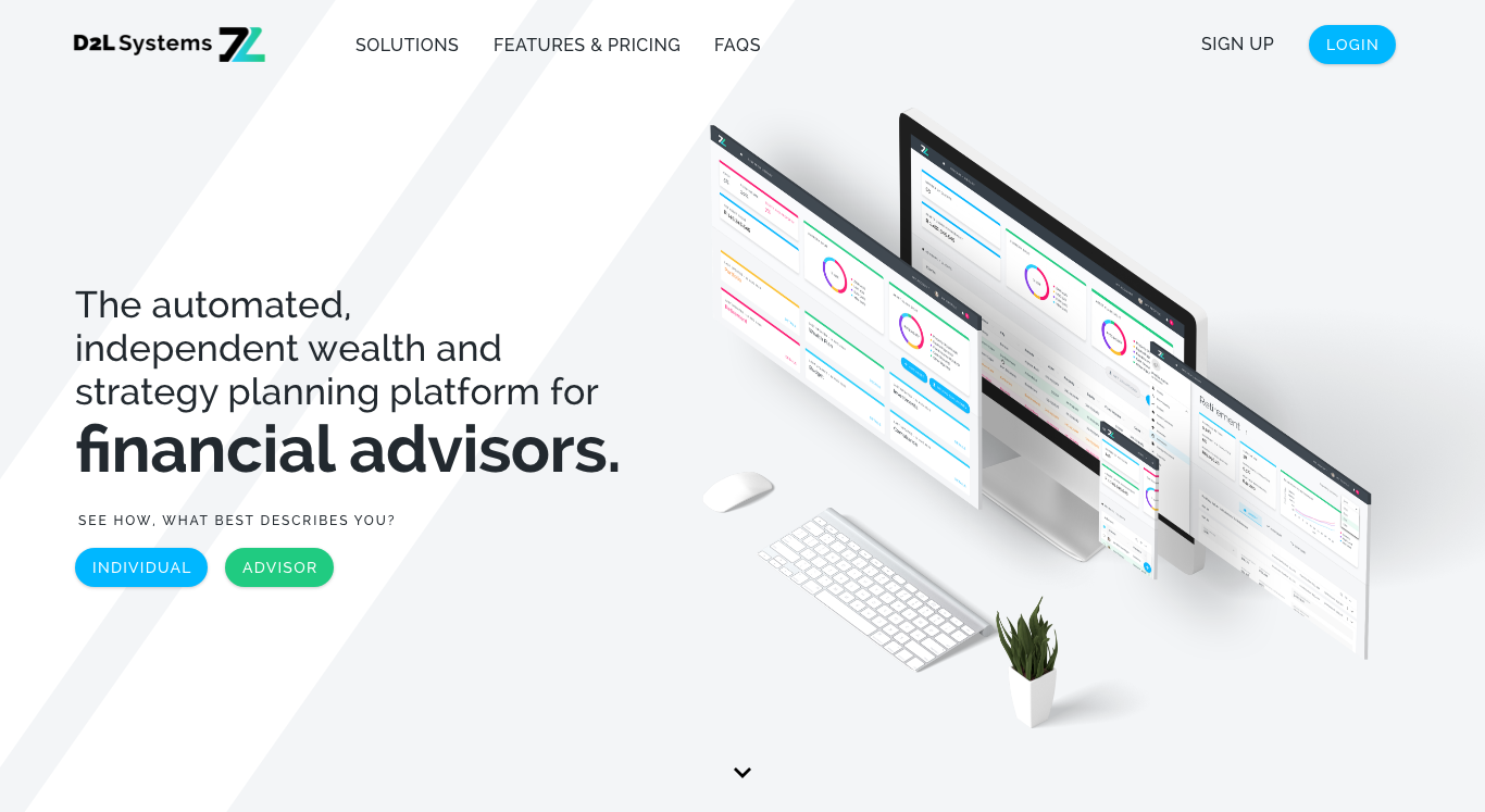
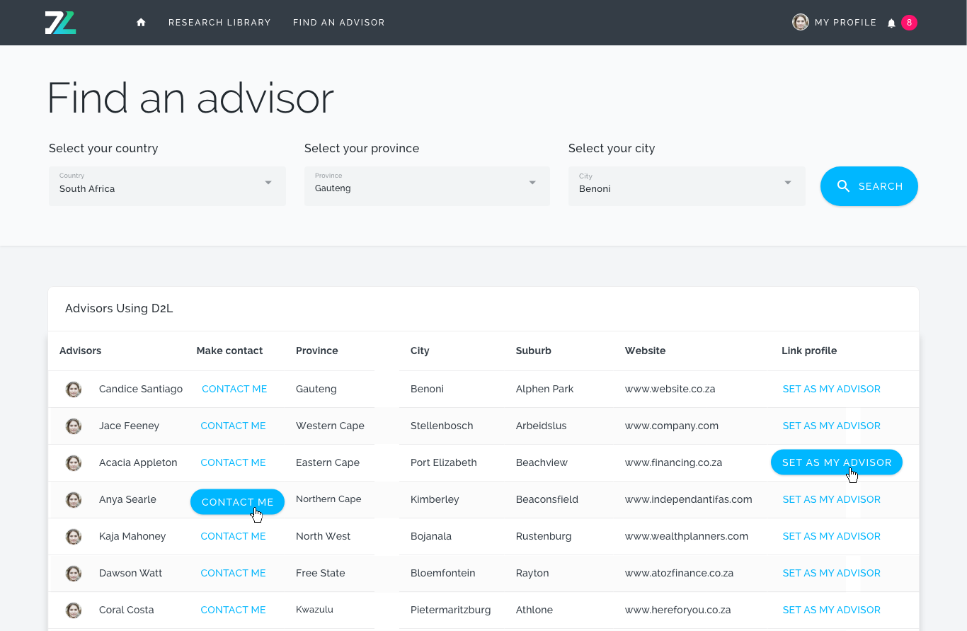
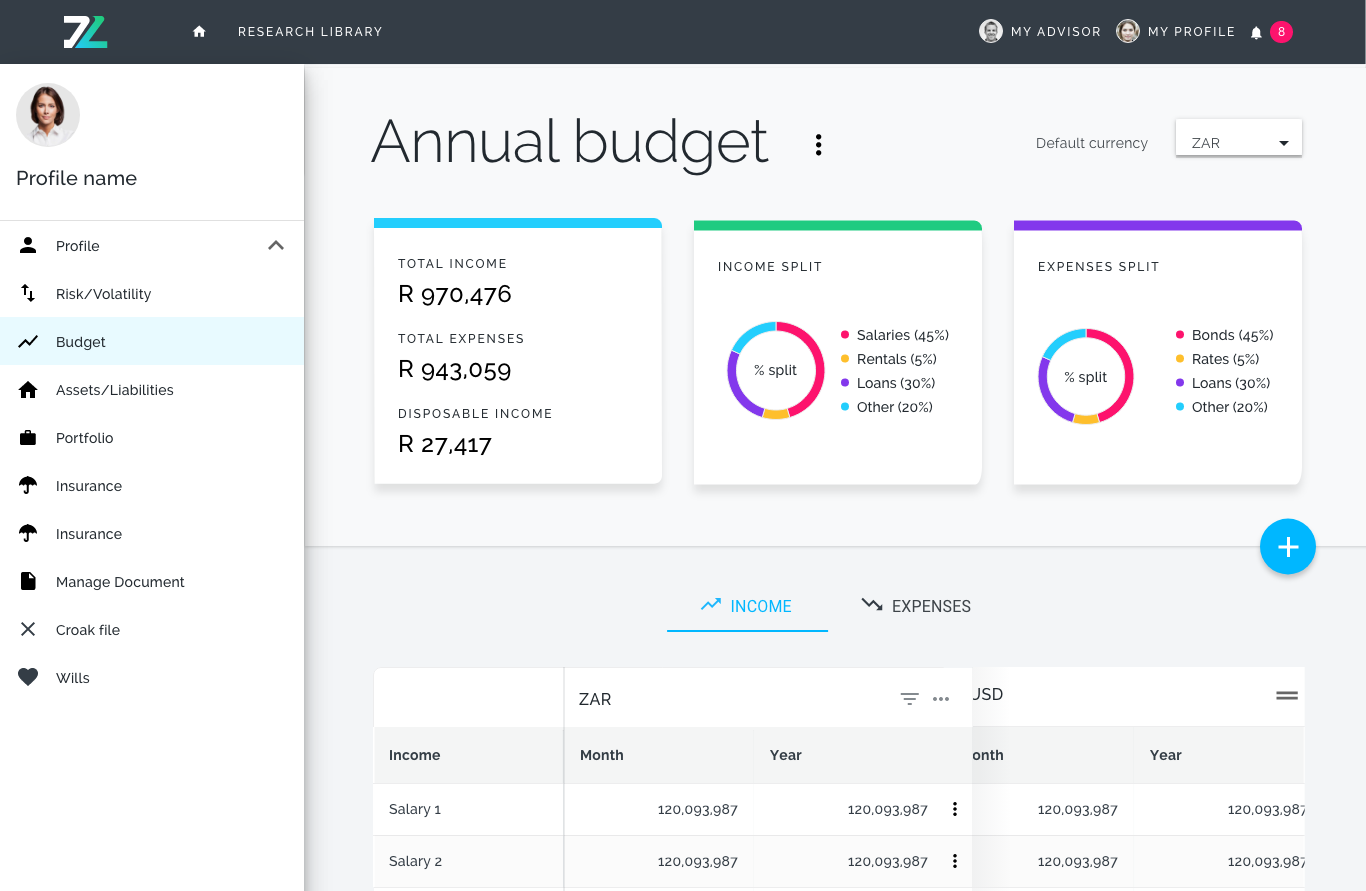
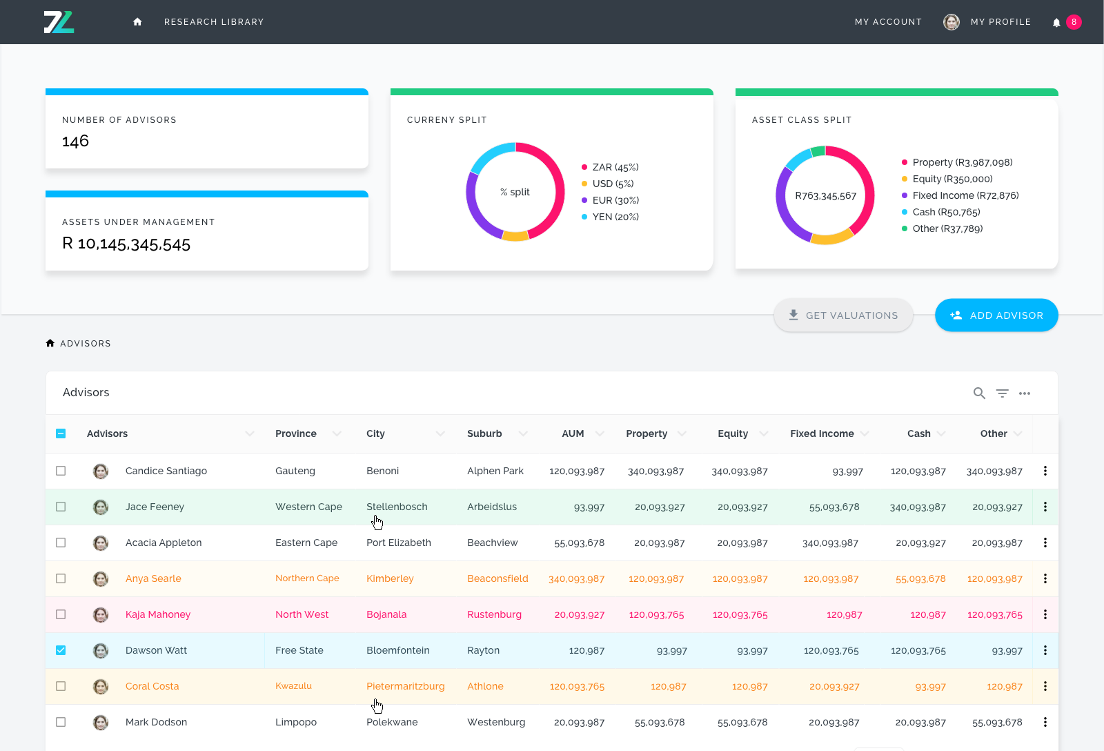
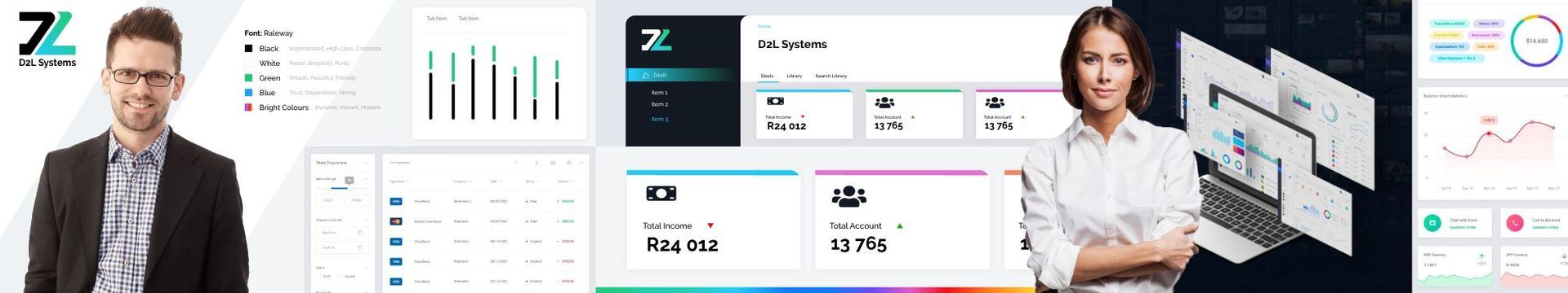
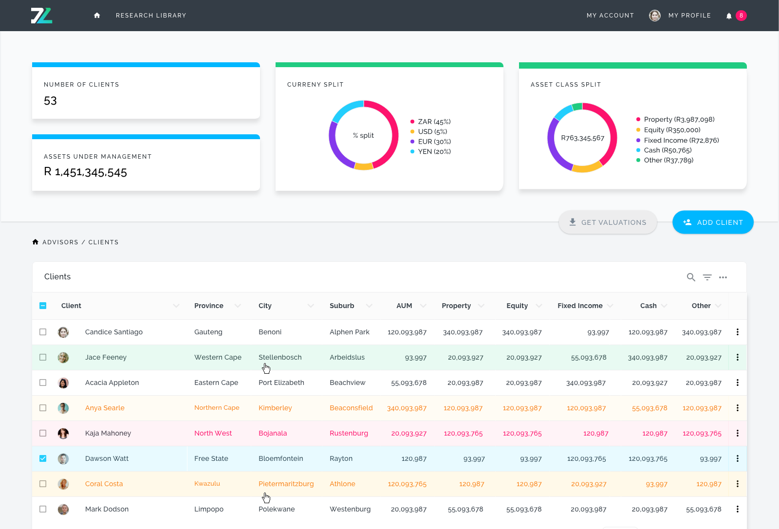
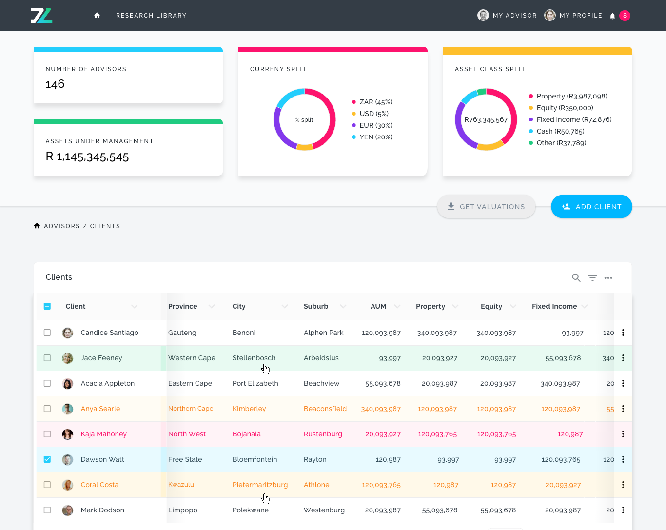
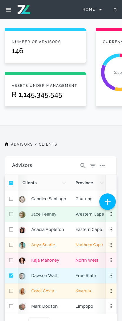
As a new player in the fintech and wealth-management space,
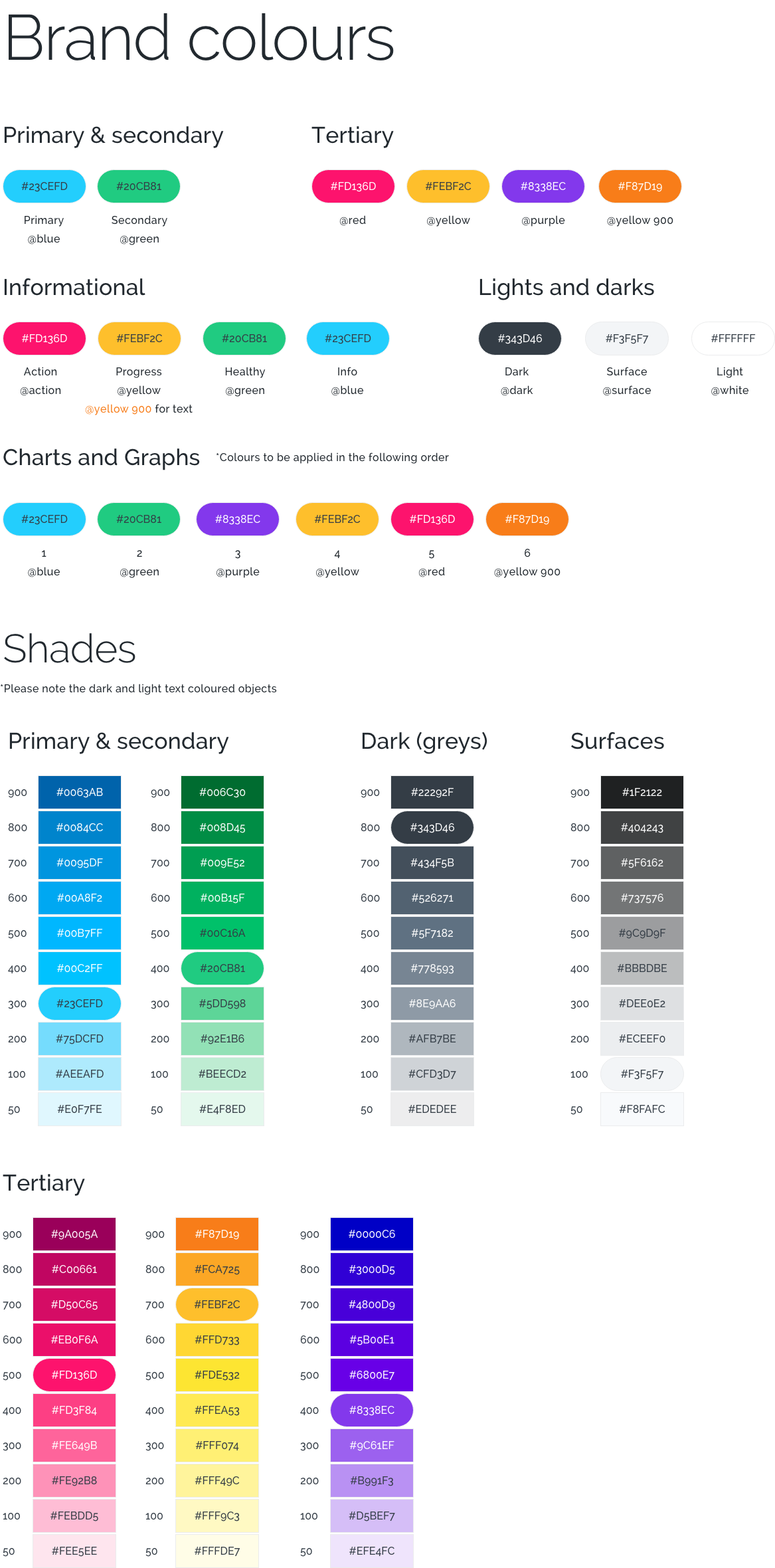
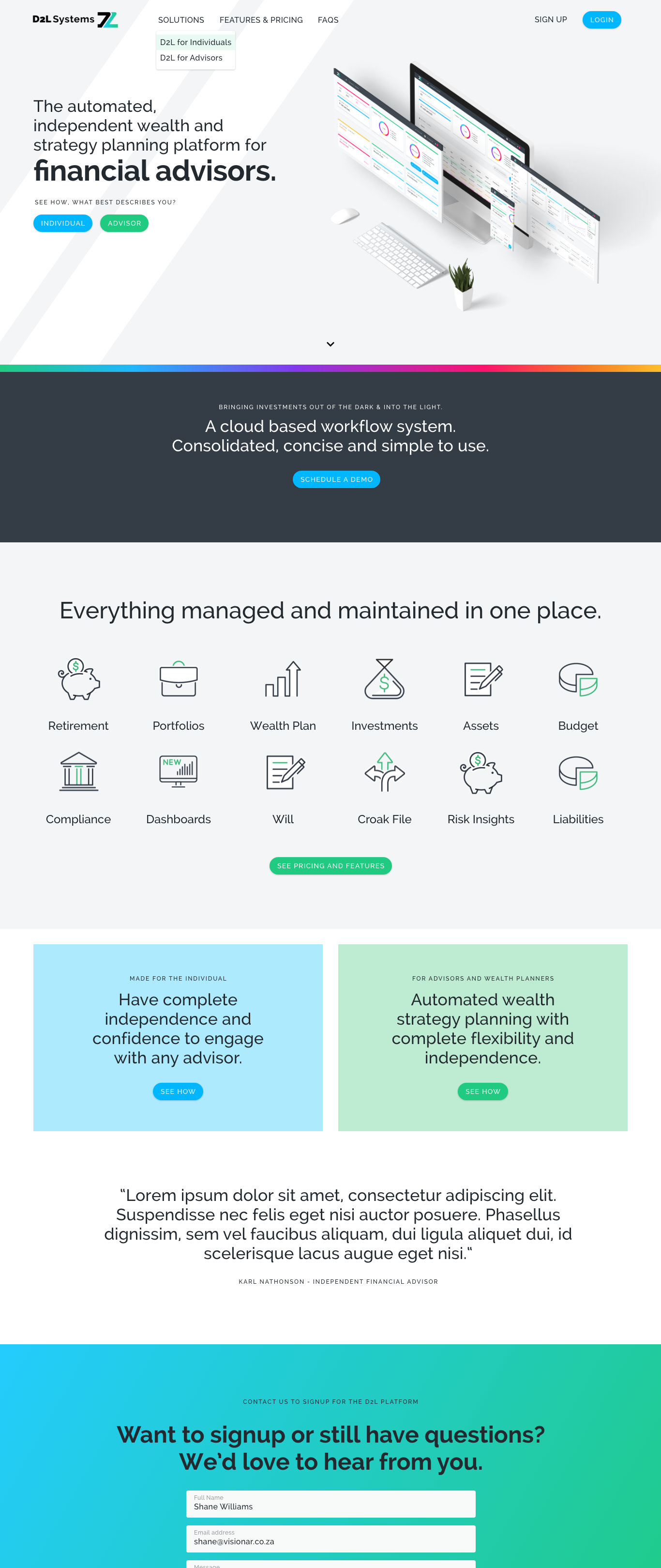
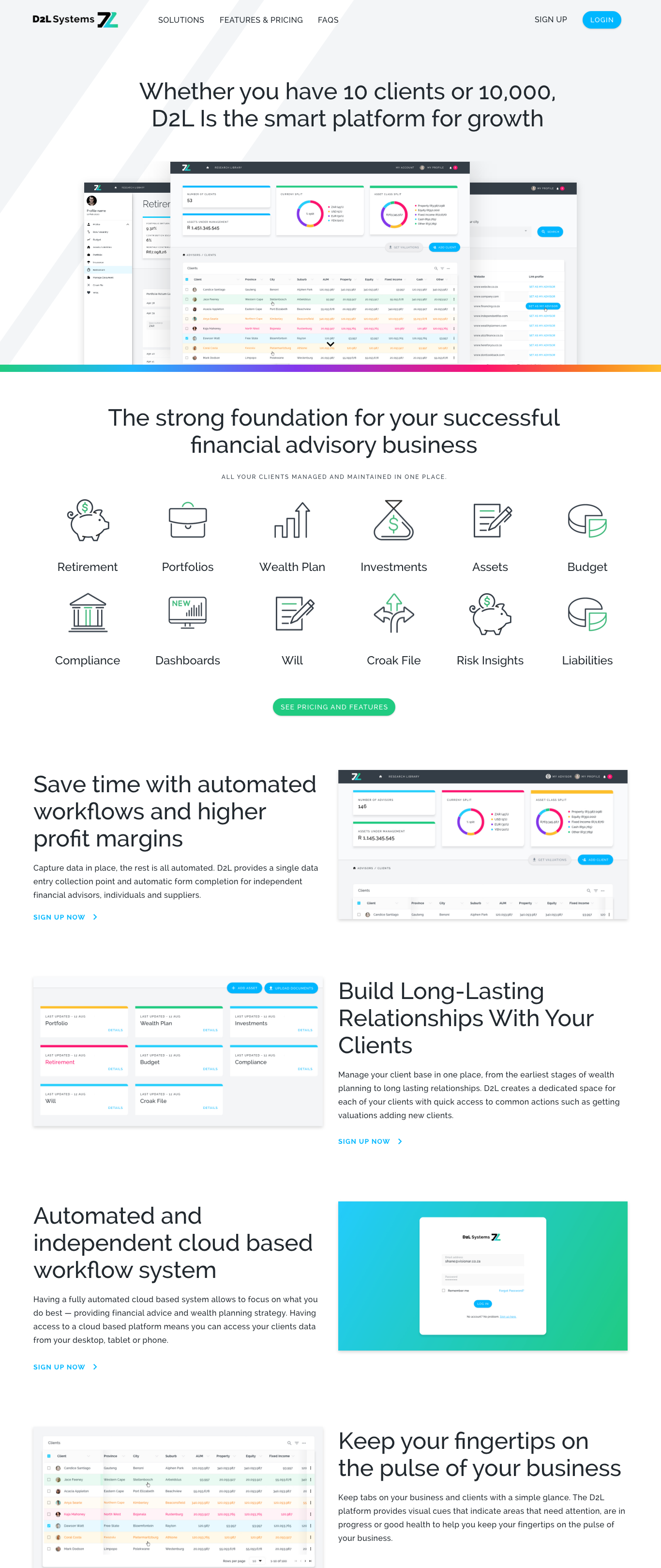
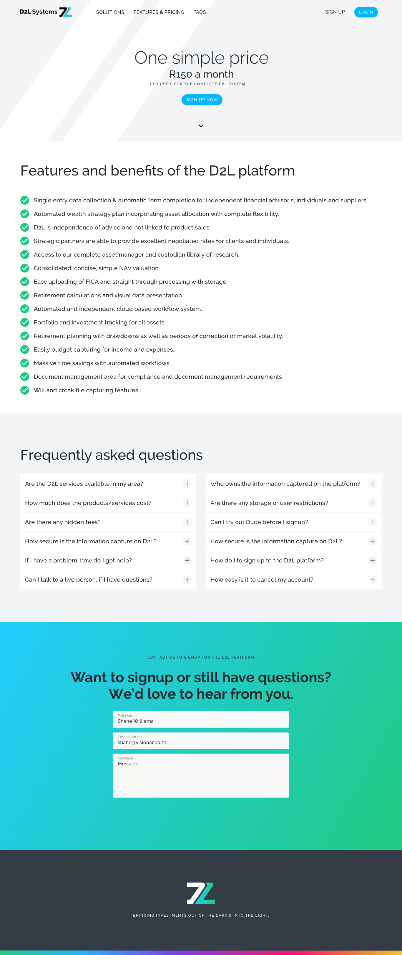
D2L had no brand identity,
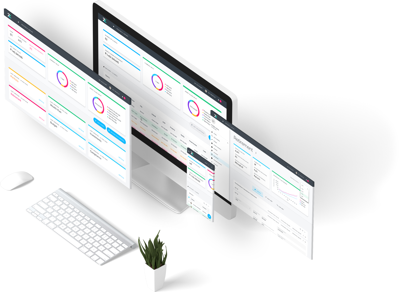
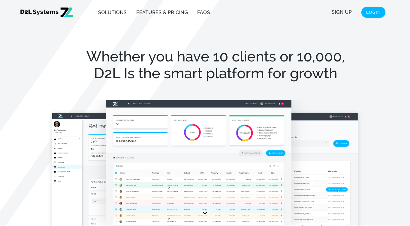
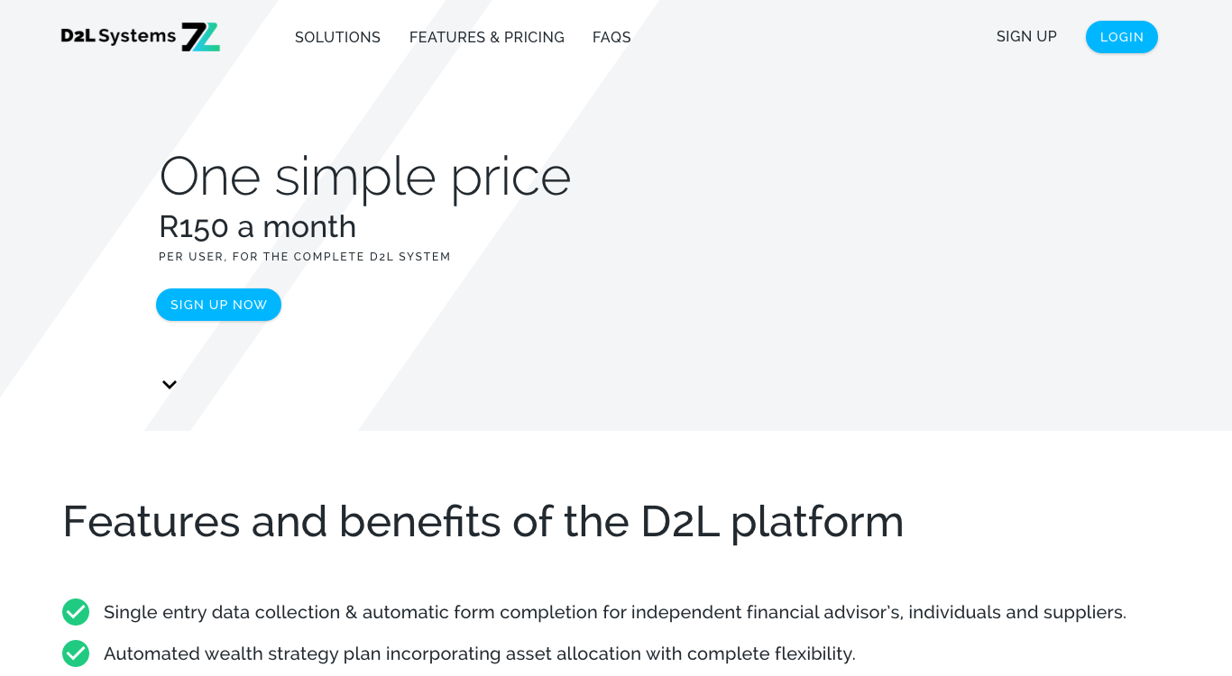
product interface
or design system to build from.
They needed to define their visual language,
user experience
and marketing presence simultaneously.
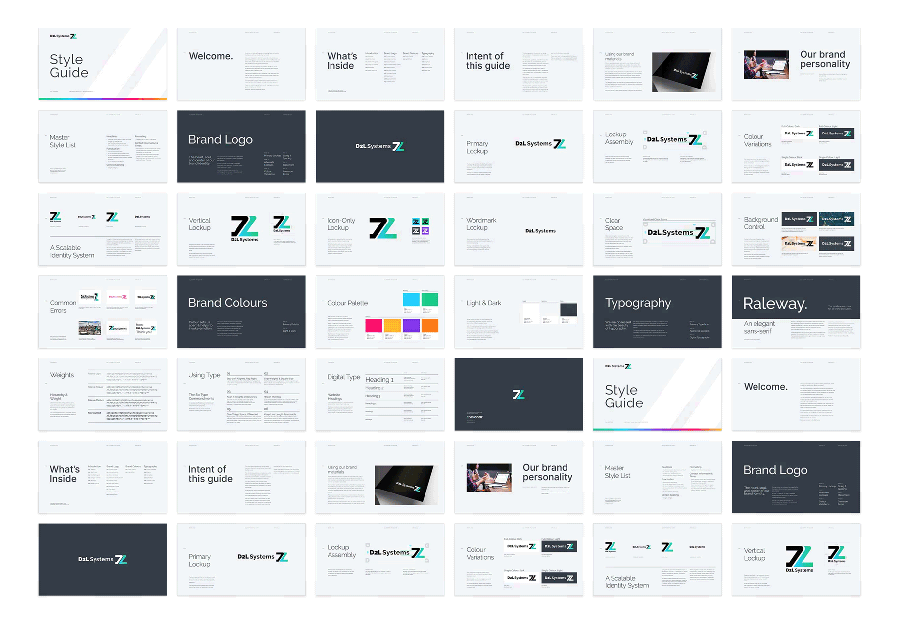
The challenge was to create a complete,
scalable foundation spanning brand,
product and design system simultaneously,
one that could grow with the business and inspire confidence from day one.