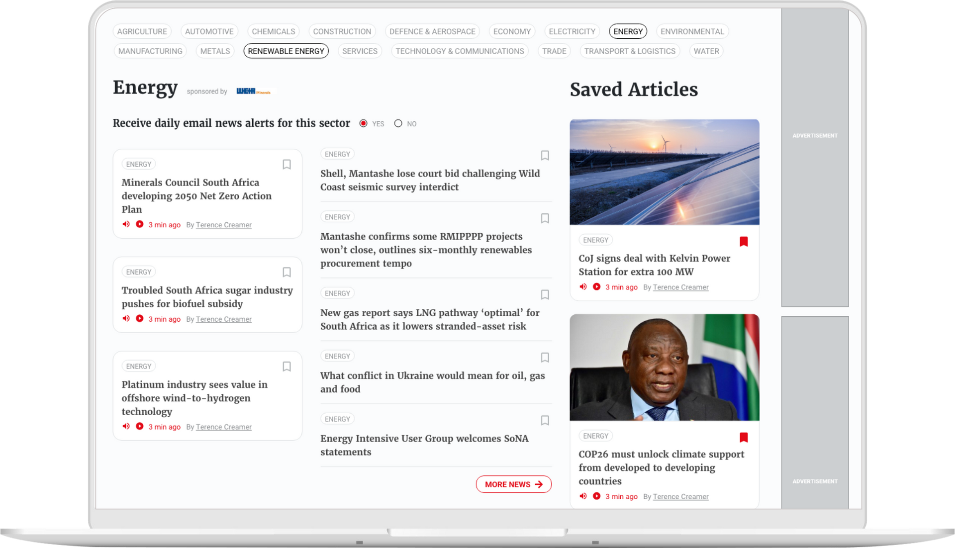
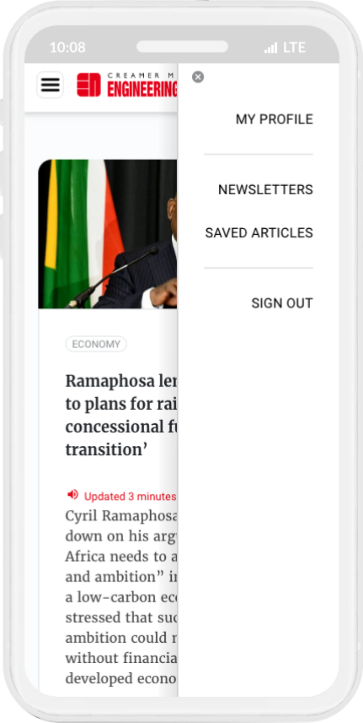
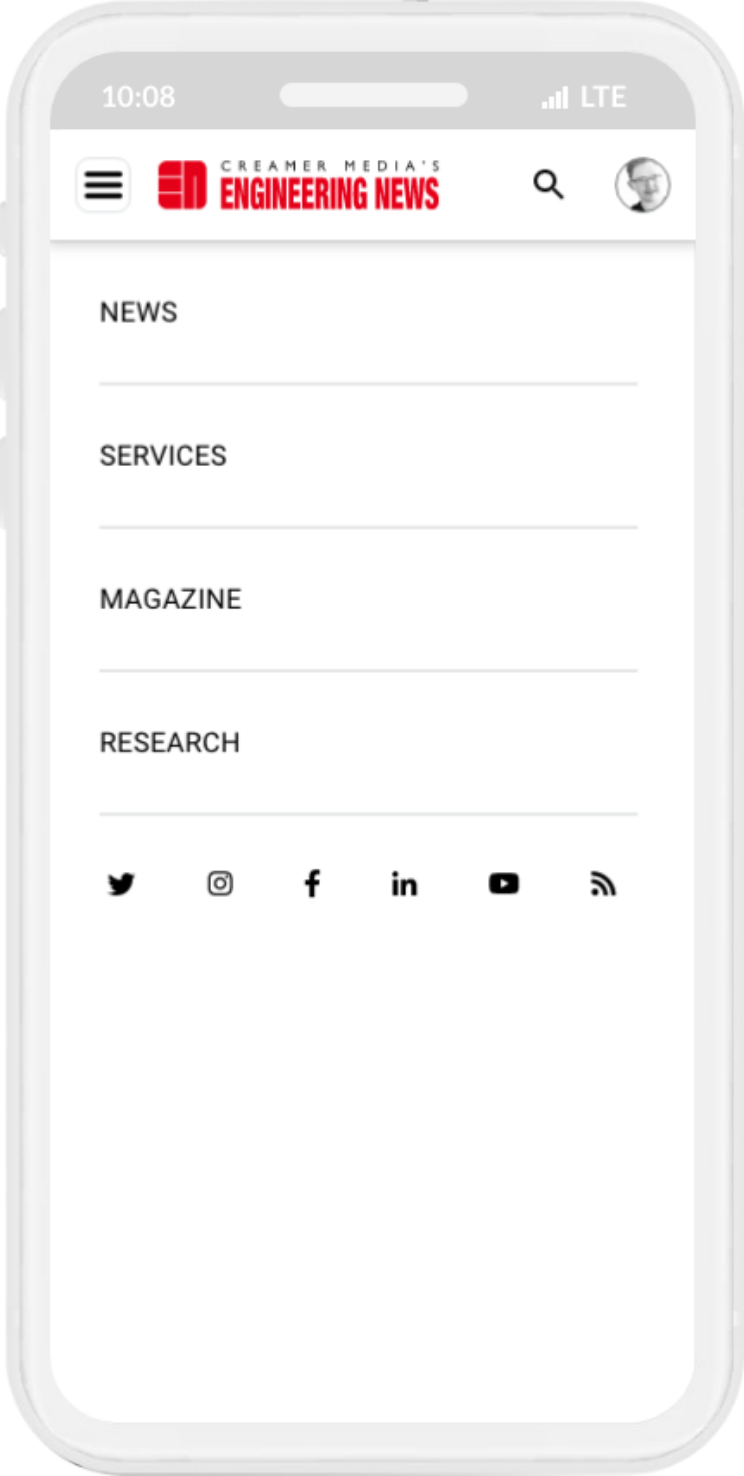
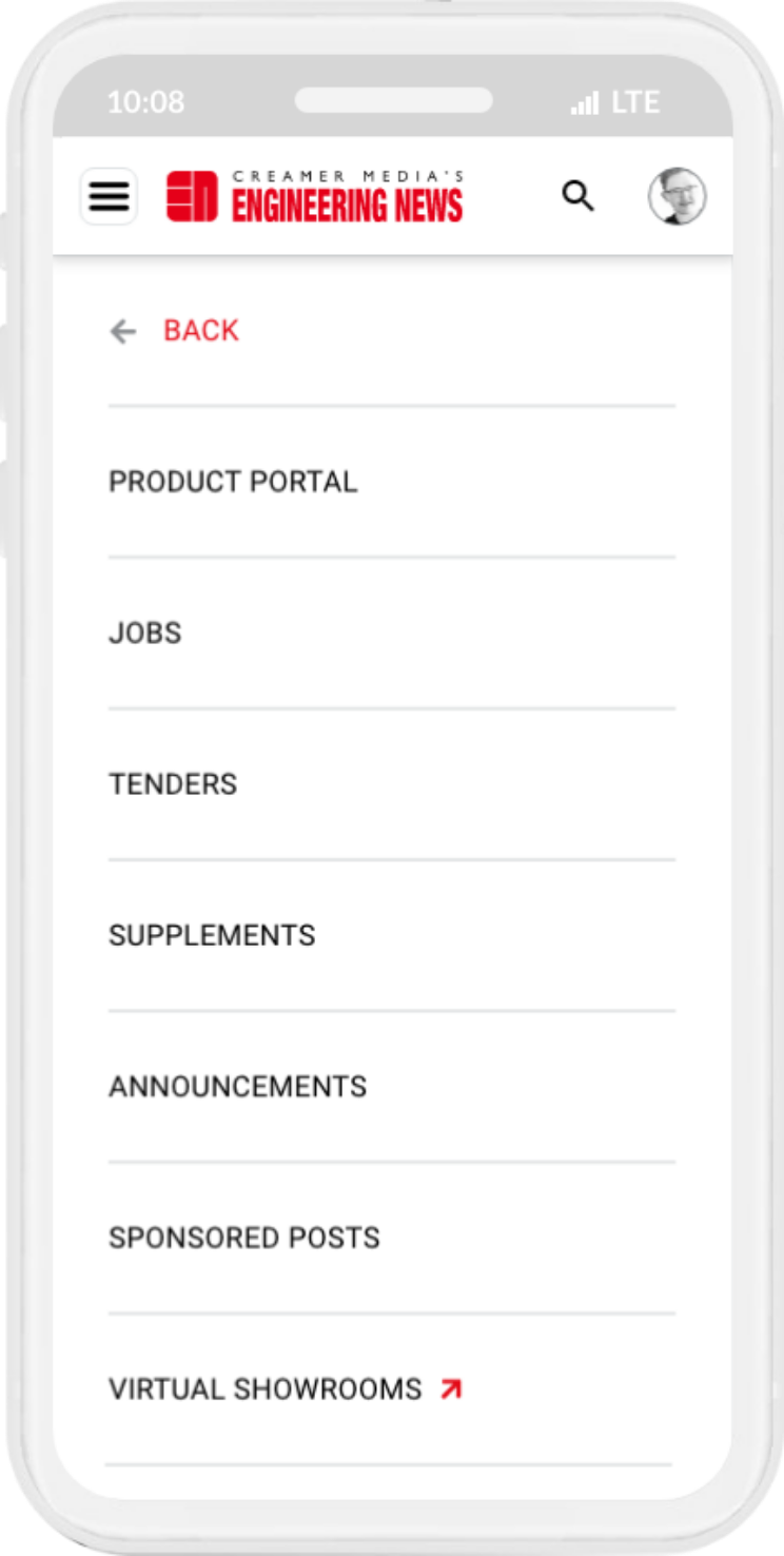
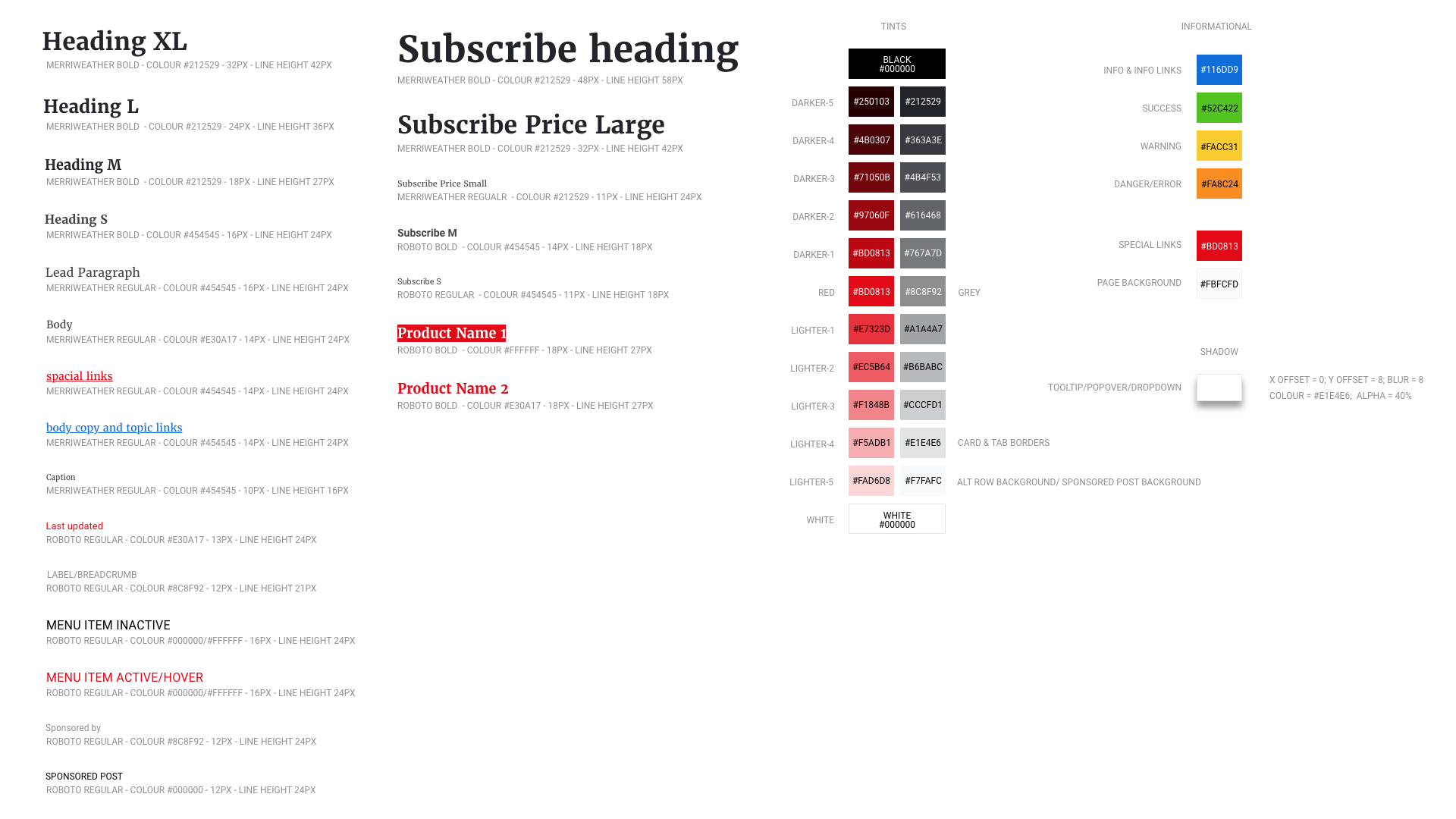
I built a library of news-focused modules (cards,
sections,
grid layouts,
menus),
supported by a consistent set of UI elements (typography,
colour,
buttons).
This modular framework meant sections could be rearranged easily even after handoff.
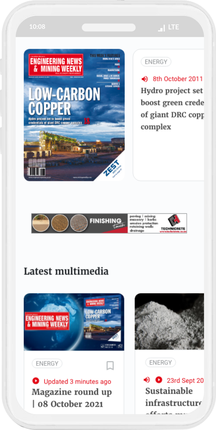
I extended that same modular logic to newsletter templates,
enabling flexible stacking of components.