

Project Summary
The team
This was executed by a small team of 3 people:
- Lead Designer (myself)
- Lead Developer (who also assisted with UX)
- Copywriter
My Role
- UX Design and Research
- UI and Interaction Design
- Information Architecture
- Wire-framing
- Prototyping
- User Acceptance Testing
- Stakeholder and Project Management
Duration
July 2017 - May 2018

STEP 1
Determining business objectives.
Discovery
Results
- Main objectives
- Secondary objectives
“Clients do not care about business objectives — it's user objectives that will drive behaviour.”
STEP 2
Who are our users,
what are their objectives?
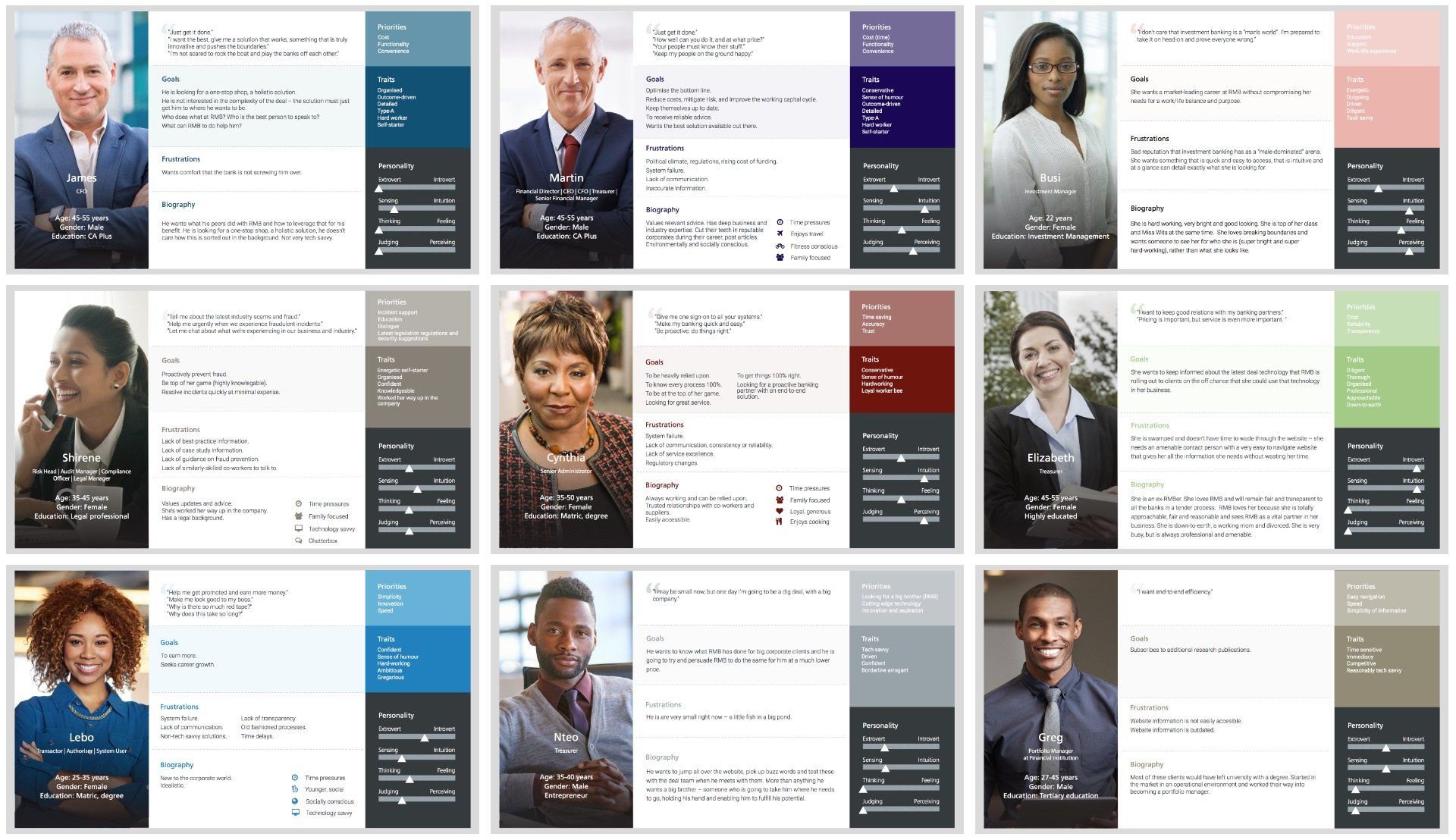
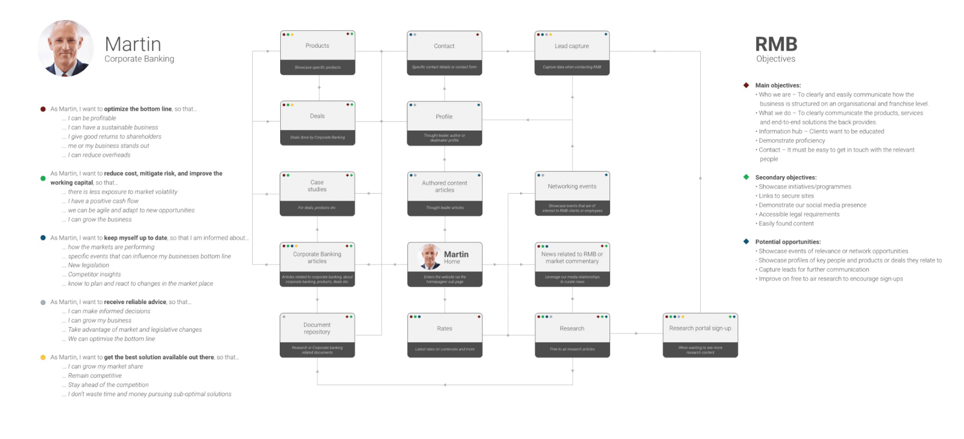
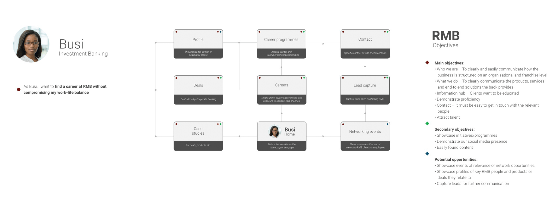
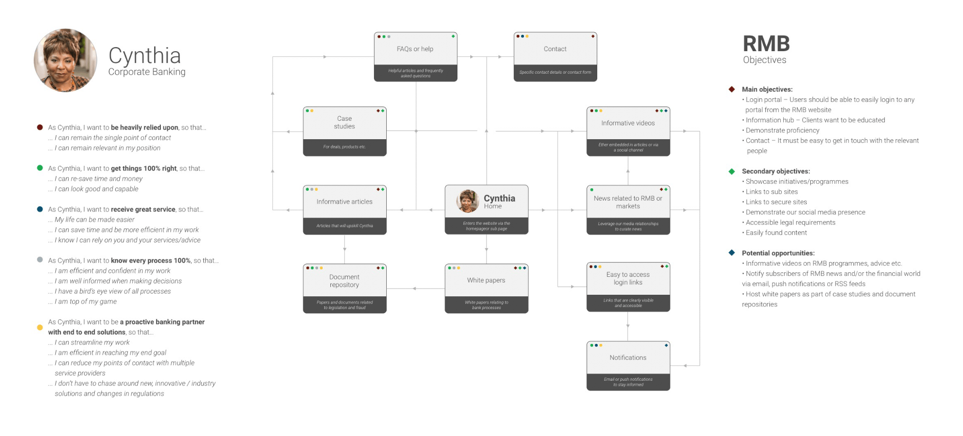
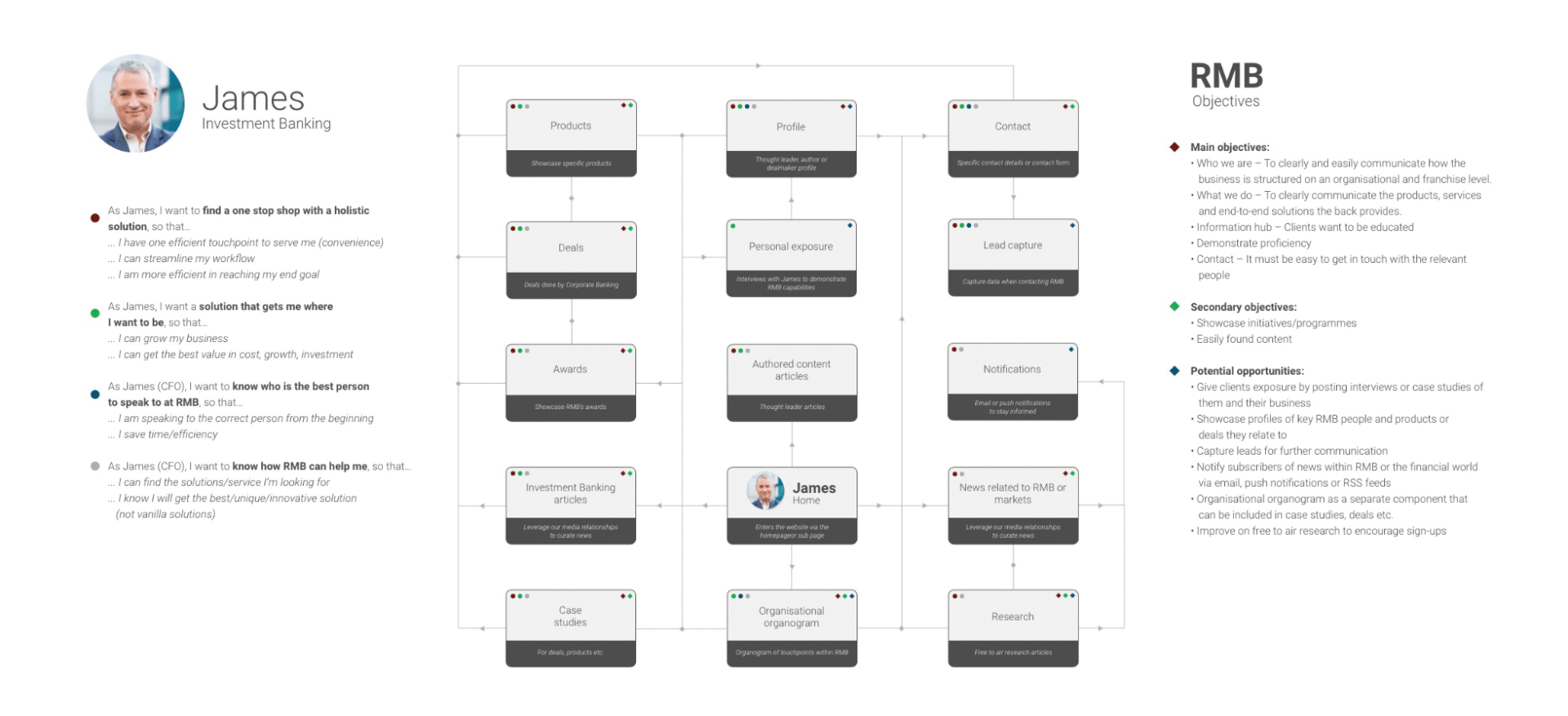
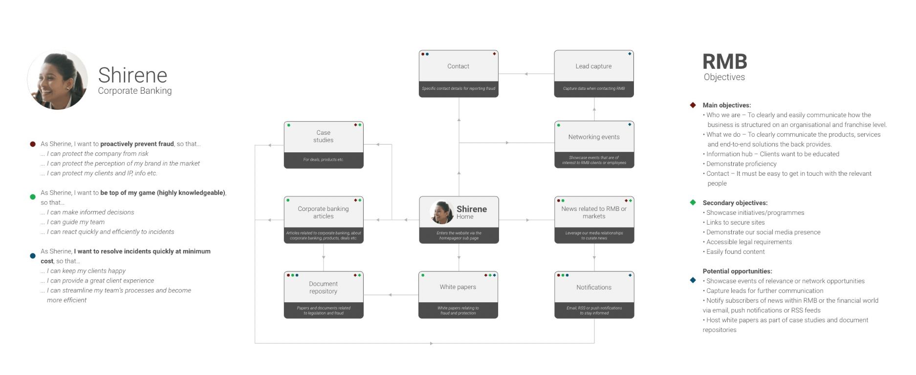
Personas
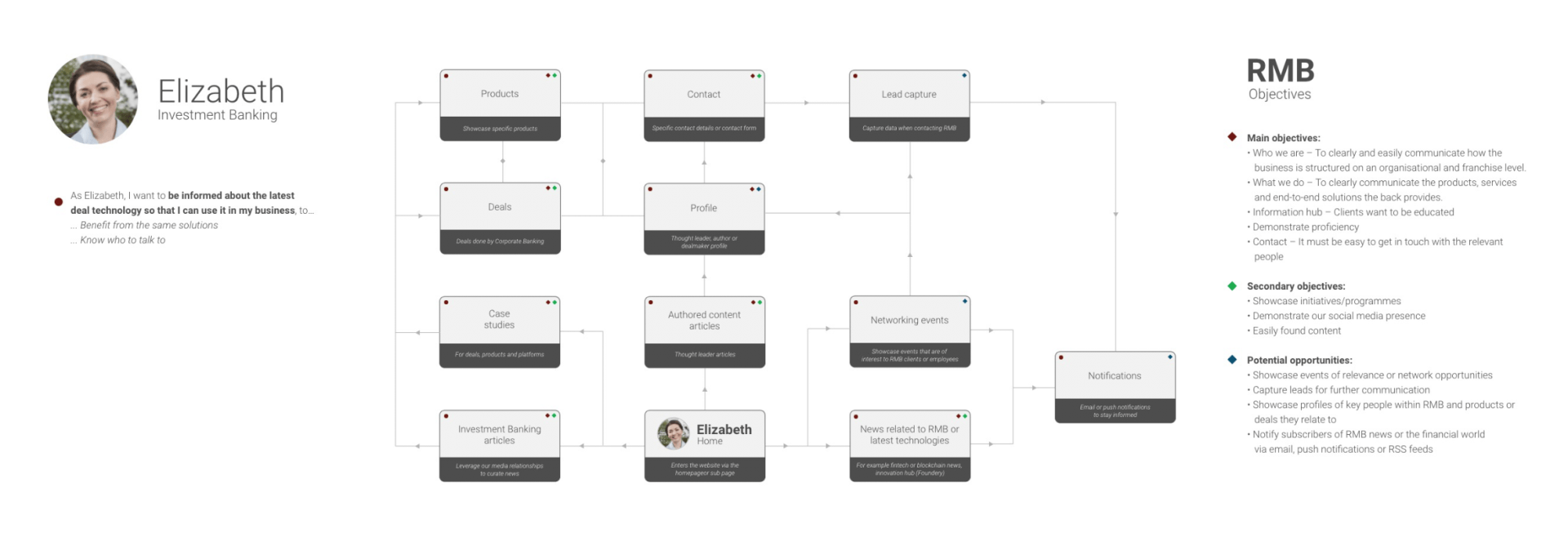
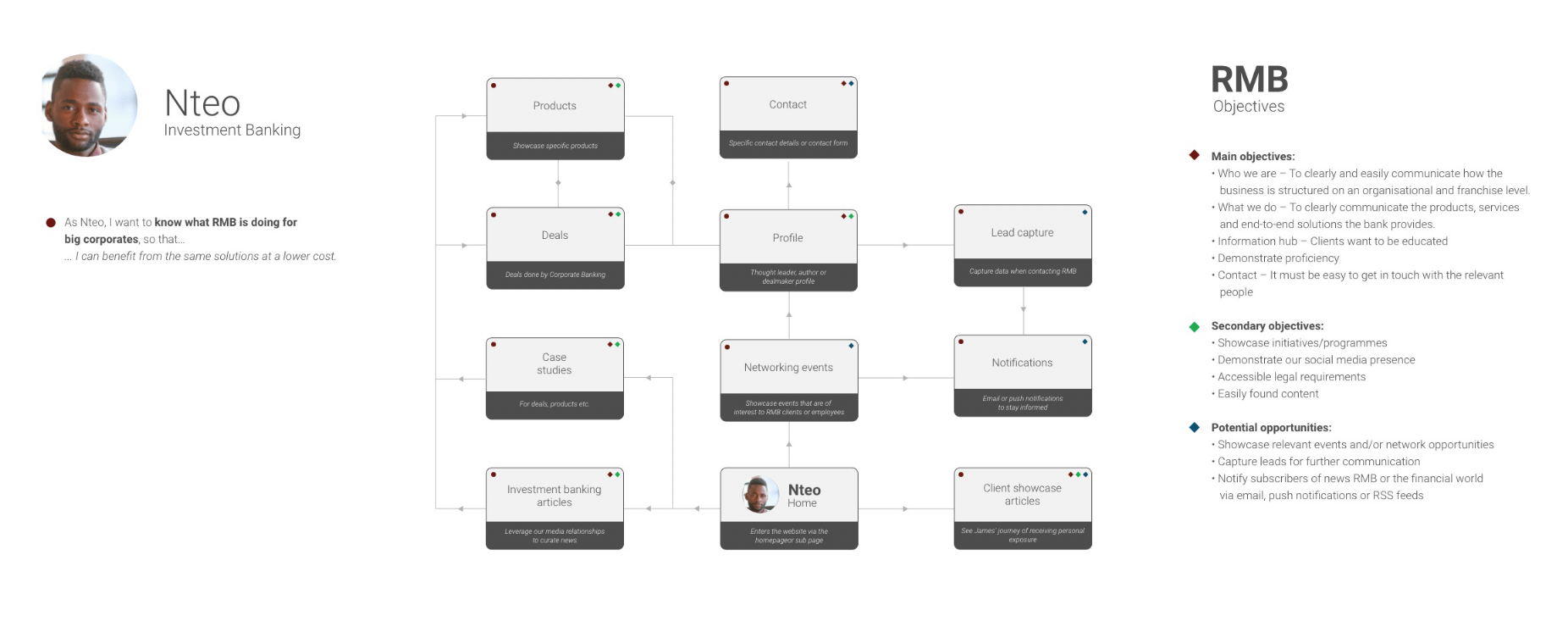
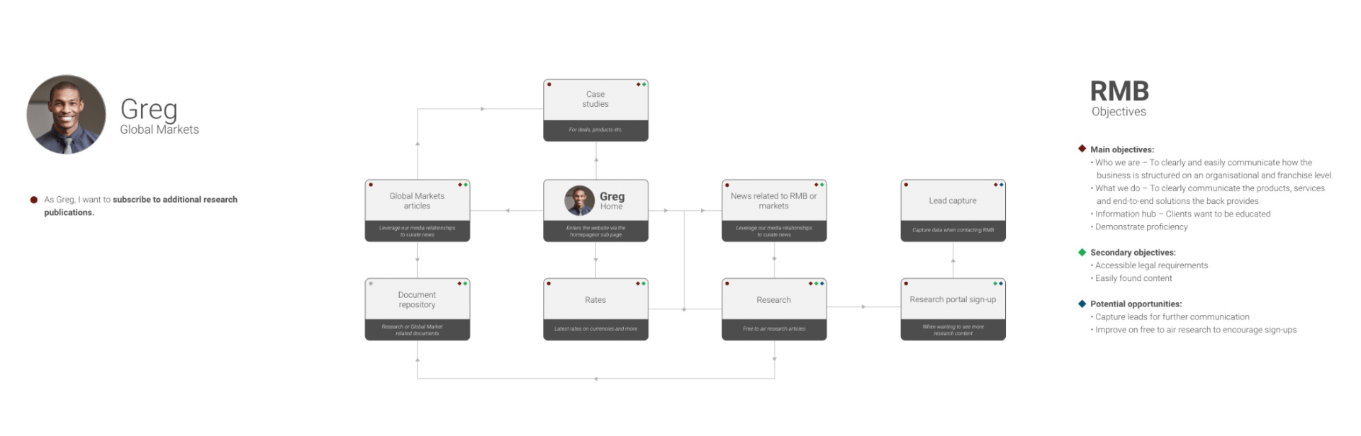
There was no clear picture of who we were talking to or user needs on the website. As gaining access to our C-Suite clients was not possible, I developed a persona worksheet and socialised it with stakeholders. These were then used to conducted interviews with staff members, deal makers and client coverage teams who had everyday exposure and access to clients.
Working with each area of the bank, we then created client personas. Between three and four personas were identified in each of the following business unit areas:
- Investment Banking
- Corporate Banking
- Global Markets
- Client coverage

STEP 3
How should the website serve the user?
Determining scope and feature requirements
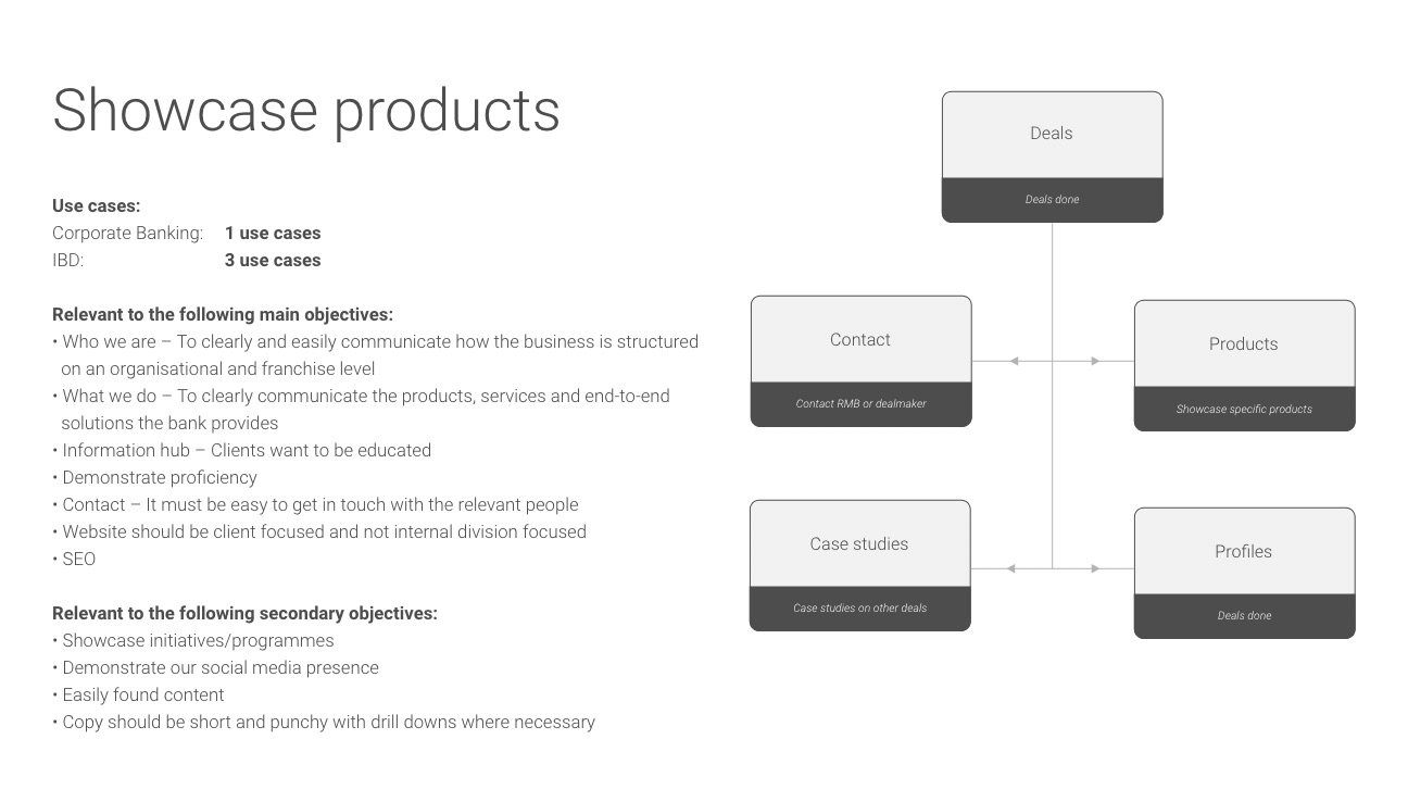
Identified feature list
- Thought leader articles/Market commentary
- Relevant contacts
- Case studies/Awards/Deals
- Research
- Product information
- Demonstrate capabilities
- Client interviews (showcases)
- Lead capture for further communication
- Showcase events
- Rates
- FAQs
- Document repository
- NotificationsTools
- Step by step guides
- Comprehensive help section
- Organograms of touchpoints
- Careers
STEP 4
How do you marry business objectives, user objectives and a feature list?


User journeys and content flows
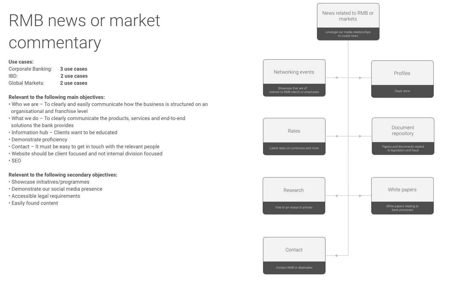
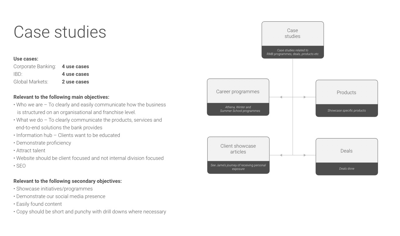
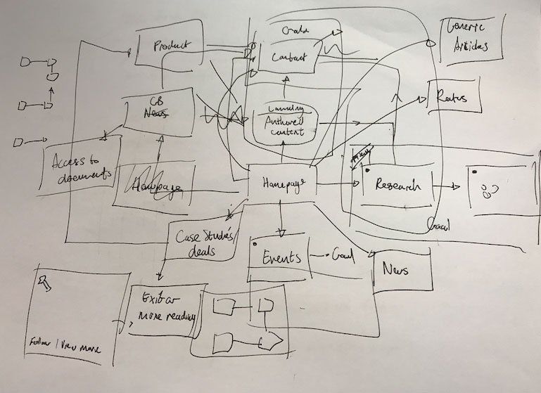
User journey maps and flows were created. User goals and business objectives were then mapped onto each touchpoint, this helped to further define the project scope and ensure both user and business needs were met.
This process also helped to identify other potential opportunities that could be facilitated through the website.
To help us better understand the information architecture and how many personas each sections of the website would benefit, we developed a second set of journey maps beginning at different entry points. This further justified the various business cases for each section of the website.
Learnings
- A user should never have to rely on the navigation to move through the website.
- A user has a number of possible journeys and those journeys were non-linear.
- The navigation should allows users to pivot quickly to a new objective.
- These learnings had a huge impact on our designed approach as well as how we engineered a system to exposed content that enabled richer user journeys.
STEP 5
Information architecture.
Organising content
While we knew how to move users through content via our card system, we still needed to solve the content hierarchy and menu navigation. Our aim was to move to a more client-centric approach to content and services, instead of mirroring internal organisational structures.
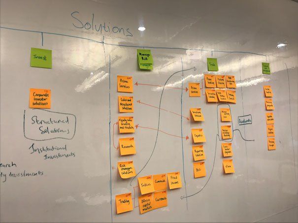
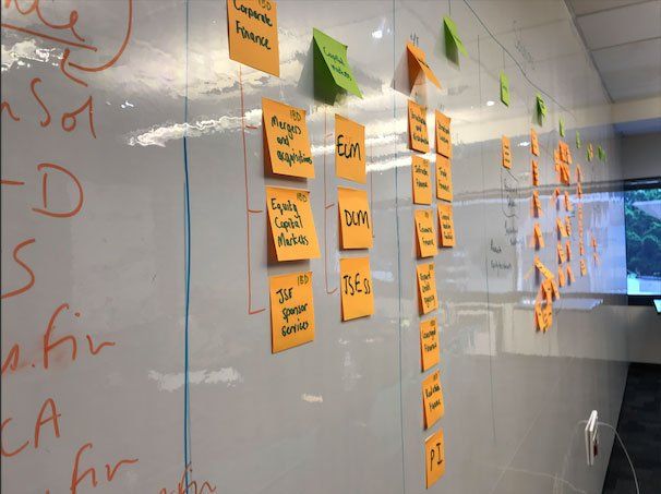
Collaboration via card sorting
Learnings
Whenever possible, get stakeholders together and facilitate collaboration with a focus on the end goal. Being the middleman via email is not a good tool for achieving consensus between stakeholders.

STEP 6
Wireframes, interface design and user acceptance testing.
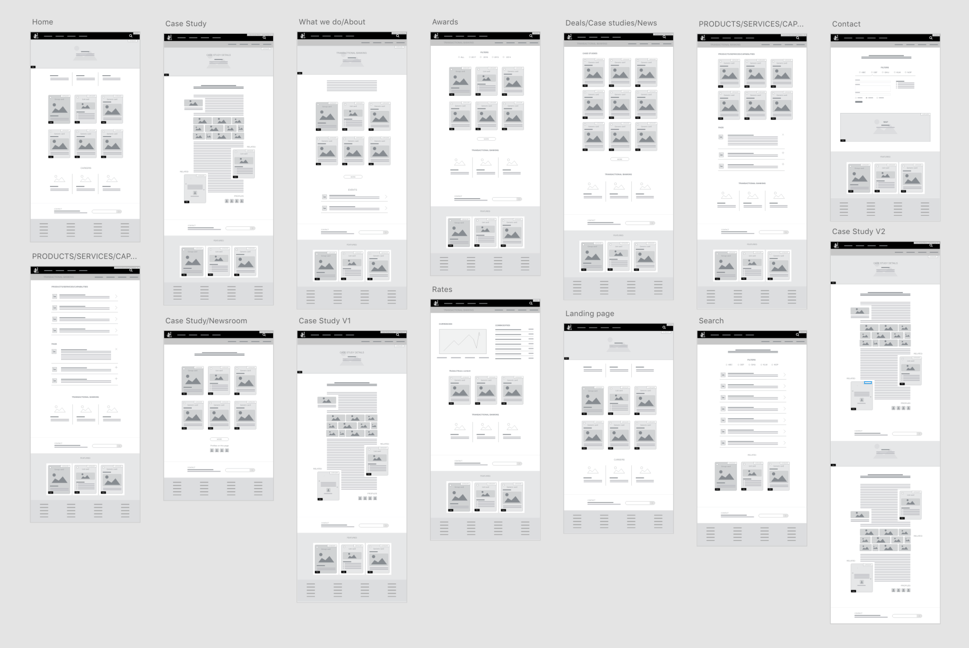
Wireframes
The user journey and research learnings informed my approach to wireframes. While referencing the identified feature list, I developed a wireframe kit of components that would form the building blocks of the website. This helped to plan and design a scalable, flexible front-end design system for the website.
I prototyped various wireframe layouts which were turned into clickable prototypes to test flows.
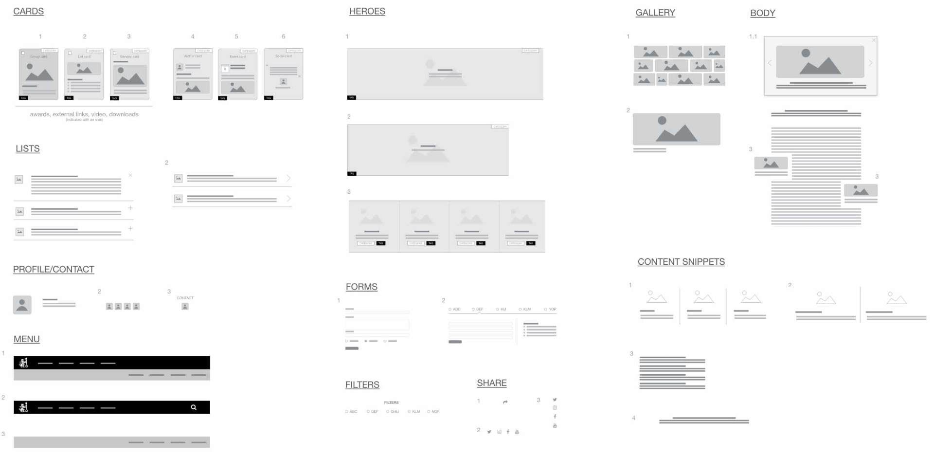
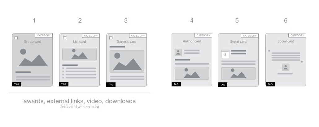
Cards enabled content discovery
Understanding that users should never have to rely on the navigation and that there were a number of possible journeys, required an extensive list of categories and tags were created. Pages and content was then be tagged and categorised with this metadata.
Every page or piece of content was then also represented on a card in the UI. These cards would surface based on their relation to the existing page content via tagging or explicitly.
33
16
24
Exploring various layout patterns via wireframes
215
(excluding deals and category pages)
204
9189
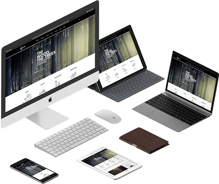
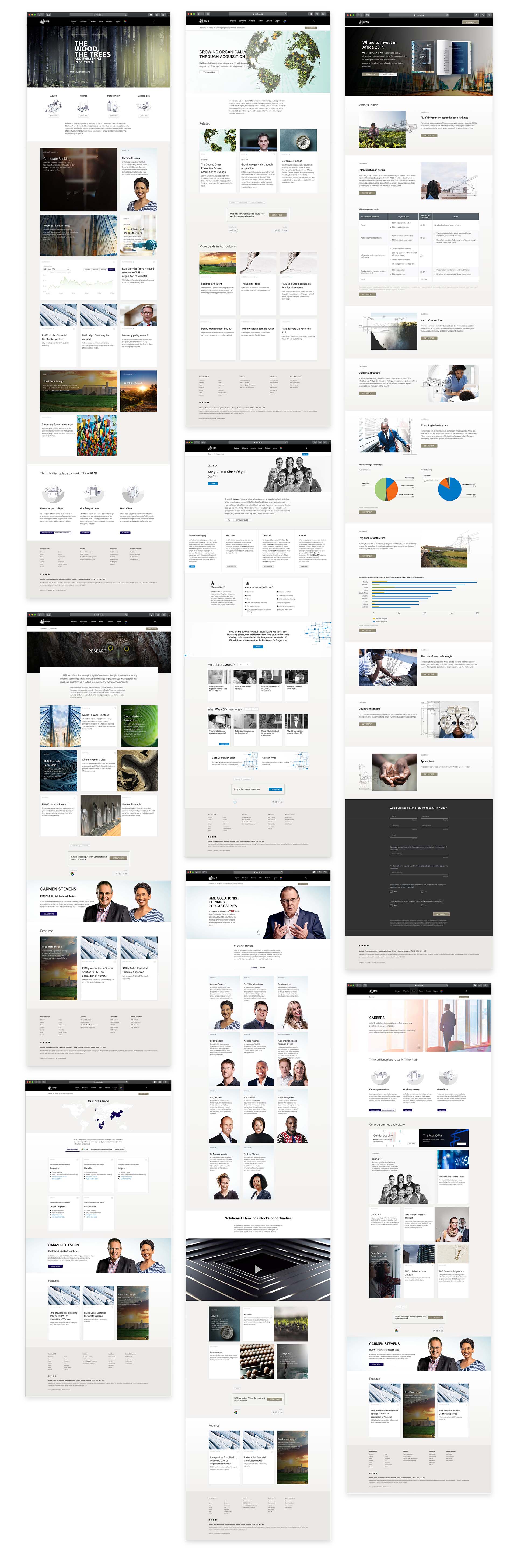
Responsive UI design
Various page designs
User acceptance testing
Post launch surveys
Insights gathered
- Users expected to be able to click on icon labels on cards – icons were later linked to click throughs.
- The 'Get in Touch' call to action area was overlooked by users, resulting in a redesigned 'Get in Touch' component.
- Related content was not understood at first - this was fixed by adding section headings to area that housed related content.
- Users expected to be able to download specific content directly from cards, this functionality was later catered for.
Project results and what I learnt.
104%
INCREASED PAGE VIEWS
52%
27%
What this project taught me
Research is a must
I would never have designed a website that was truly useful to both business and users without my research. The user survey revealed unexpected information and made it possible to adapt the product to users’ needs.
Personas are powerful
Being aware of users’ needs, goals and objectives helped me to create a seamless, end-to-end experience.
Involve stakeholders
Stakeholders know the business best, engaging with them allowed us to build an informed information architecture.
Challenges
One of the challenges faced with this project was the lack of a content management system, as a result we were forced to build and architect our own light-weight internal CMS. The project was strongly taxonomy driven, as each piece of content was associated with multiple categories and contacts. This allowed us to serve related content as well as group content together on landing pages. Each landing page also had a lead capture form which connected leads to specific business contacts. We had to build systems to help facilitate these processes.